20 Supplementary Figure 15
20.1 Summary
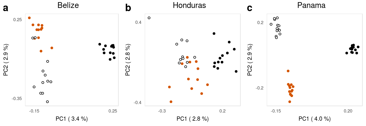
This is the accessory documentation of Supplementary Figure 15.
The Figure can be recreated by running the R script S15.R:
cd $WORK/3_figures/F_scripts

Rscript --vanilla S15.R
rm Rplots.pdf
20.2 Details of S15.R
The S15.R script is a subset of the F1.R script run including data sets filtered for a minimum distance between the SNPs. Is an executable R script that depends on the tidyverse package for data managing and plotting as well as on the cowplot package for plot composition.
It also depends on the helper script F1.functions.R.
library(tidyverse)
source("../../0_data/0_scripts/F1.functions.R")
20.2.1 Setup
First, we load some metadata about the samples, define some colors and read in the PCA data for the three locations.
dataAll <- read.csv('../../0_data/0_resources/F1.sample.txt',sep='\t') %>%
  mutate(loc=substrRight(as.character(id),3))

cFILL <- rgb(.7,.7,.7)
ccc<-rgb(0,.4,.8)
clr<-c('#000000','#d45500','#000000')
fll<-c('#000000','#d45500','#ffffff')
eVclr <- c(rep('darkred',2),rep(cFILL,8))

belPCA <- readRDS('../../2_output/08_popGen/04_pca/bel_ld/belpca.Rds')
honPCA <- readRDS('../../2_output/08_popGen/04_pca/hon_ld/honpca.Rds')
panPCA <- readRDS('../../2_output/08_popGen/04_pca/pan_ld/panpca.Rds')
20.2.2 Subplots
Then, for each location, we add the sample information and extract the amount of explains variation for the individual PCs. We crate the x- and y-labels for the axis and plot the PCA
20.2.2.1 Honduras:
dataHON <- cbind(dataAll %>% filter(sample=='sample',loc=='hon')%>% select(id,spec),
                 honPCA$scores); names(dataHON)[3:12]<- paste('PC',1:10,sep='')
exp_varHON <- (honPCA$singular.values[1:10])^2/length(honPCA$maf)
xlabHON <- paste('PC1 (',sprintf("%.1f",exp_varHON[1]*100),'%)')# explained varinace)')
ylabHON <- paste('PC2 (',sprintf("%.1f",exp_varHON[2]*100),'%)')# explained varinace)')
p1 <- ggplot(dataHON,aes(x=PC1,y=PC2,col=spec,fill=spec))+geom_point(size=1.1,shape=21)+
  scale_color_manual(values=clr,guide=F)+
  ggtitle('Honduras')+
  scale_fill_manual(values=fll,guide=F)+theme_mapK+
  theme(legend.position='bottom',plot.title = element_text(size = 11,hjust = .45),
        panel.border = element_rect(color=rgb(.9,.9,.9),fill=rgb(1,1,1,0)),
        plot.margin = unit(c(3,rep(5,3)),'pt'))+#coord_equal()+
  scale_x_continuous(name=xlabHON,breaks = c(-.3,.2))+
  scale_y_continuous(name=ylabHON,breaks = c(-.4,.4))
20.2.2.2 Belize:
dataBEL <- cbind(dataAll %>% filter(sample=='sample',loc=='bel') %>% select(id,spec),
                 belPCA$scores); names(dataBEL)[3:12]<- paste('PC',1:10,sep='')

exp_varBEL <- (belPCA$singular.values[1:10])^2/length(belPCA$maf)
xlabBEL <- paste('PC1 (',sprintf("%.1f",exp_varBEL[1]*100),'%)')
ylabBEL <- paste('PC2 (',sprintf("%.1f",exp_varBEL[2]*100),'%)')

p2 <- ggplot(dataBEL,aes(x=PC1,y=PC2,col=spec,fill=spec))+geom_point(size=1.1,shape=21)+
  scale_color_manual(values=clr,guide=F)+
  ggtitle('Belize')+
  scale_fill_manual(values=fll,guide=F)+theme_mapK+
  theme(legend.position='bottom',plot.title = element_text(size = 11,hjust = .45),
        panel.border = element_rect(color=rgb(.9,.9,.9),fill=rgb(1,1,1,0)),
        plot.margin = unit(c(3,rep(5,3)),'pt'))+
  scale_x_continuous(name=xlabBEL,breaks = c(-.15,.25))+
  scale_y_continuous(name=ylabBEL,breaks = c(-.35,.25))
20.2.2.3 Panama:
dataPAN <- cbind(dataAll %>% filter(sample=='sample',loc=='boc',spec!='gum')%>% select(id,spec),
                 panPCA$scores); names(dataPAN)[3:12]<- paste('PC',1:10,sep='')
exp_varPAN <- (panPCA$singular.values[1:10])^2/length(panPCA$maf)
xlabPAN <- paste('PC1 (',sprintf("%.1f",exp_varPAN[1]*100),'%)')
ylabPAN <- paste('PC2 (',sprintf("%.1f",exp_varPAN[2]*100),'%)')
p3 <- ggplot(dataPAN,aes(x=PC1,y=PC2,col=spec,fill=spec))+geom_point(size=1.1,shape=21)+
  scale_color_manual(values=clr,guide=F)+
  ggtitle('Panama')+
  scale_fill_manual(values=fll,guide=F)+theme_mapK+
  theme(legend.position='bottom',plot.title = element_text(size = 11,hjust = .45),
        panel.border = element_rect(color=rgb(.9,.9,.9),fill=rgb(1,1,1,0)),
        plot.margin = unit(c(3,rep(5,3)),'pt'))+
  scale_x_continuous(name=xlabPAN,breaks = c(-.15,.2))+
  scale_y_continuous(name=ylabPAN,breaks = c(-.2,.2))
20.2.3 Composition
Using the cowplot package we put together the final figure.
S15 <- cowplot::plot_grid(p2, p1, p3, nrow = 1, labels = letters[1:3])The Figure is then exported using ggsave():
ggsave(plot = S15,filename = '../output/S15.pdf',width = 183,height = 63,units = 'mm',device = cairo_pdf)