3 Figure 1
3.1 Summary
This is the accessory documentation of Figure 1. The Figure can be recreated by running the R script F1.R:
cd $WORK/3_figures/F_scripts

Rscript --vanilla F1.R
rm Rplots.pdf
3.2 Details of F1.R
In the following, the individual steps of the R script are documented. Is an executable R script that depends on a variety of image manipulation and geodata packages. Additionally, the supporting R script (F1.functions.R) in needed:
library(sp)
library(maptools)
library(scales)
library(PBSmapping)
library(RColorBrewer)
library(tidyverse)
library(ggforce)
library(cowplot)
library(scatterpie)
library(hrbrthemes)
library(cowplot)
library(grid)
library(gridSVG)
library(grImport2)
library(grConvert)
library(ggmap)
library(marmap)
source("../../0_data/0_scripts/F1.functions.R")
3.2.1 Fig. 1 A)
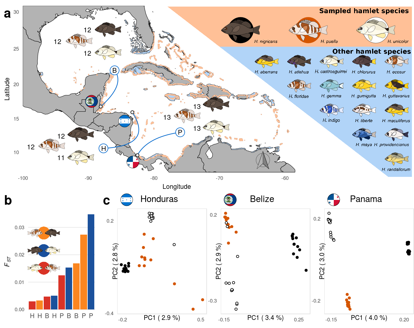
First, we load the data sheet containing the sampling location as well as the population specifics for each sample and sub sample it to include only the samples included in the re-sequencing study.
The Coordinates need to be transformed from (deg min sec) to decimal degrees. The sample inventory is summarized over populations and merged with the coordinates later used for the sample pointers.
dataAll <- read.csv('../../0_data/0_resources/F1.sample.txt',sep='\t') %>% mutate(loc=substrRight(as.character(id),3))
data <- dataAll %>% filter(sample=="sample")
dataSum <- data%>% rowwise()%>% mutate(nn = sum(as.numeric(strsplit(as.character(`Latittude.N`),' ')[[1]])*c(1,1/60,1/3600)),
                                       ww = sum(as.numeric(strsplit(as.character(`Longitude.W`),' ')[[1]])*c(1,1/60,1/3600))) %>%
  group_by(loc) %>% summarise(n=mean(nn,na.rm = T),w=-mean(ww,na.rm = T)) %>%
  as.data.frame() %>% cbind(.,read.csv('../../0_data/0_resources/F1.pointer.csv'))
Then, we read in the coordinates of helper points that will be used to draw the bezier curves of the sample pointers. We also set the spacial range of the map.
crvs <- read.csv('../../0_data/0_resources/F1.curve.csv')
xlimW = c(-100,-53); ylimW = c(7,30.8)
The base map relies on the world data from the maps package. This data is loaded and clipped to the extend of the plotting area.
worldmap = map_data("world")
names(worldmap) <- c("X","Y","PID","POS","region","subregion")
worldmap = clipPolys(worldmap, xlim=xlimW,ylim=ylimW, keepExtra=TRUE)
External images are loaded for annotation. This includes the hamlet images, the country flags and legend.
# compas and legend
compGrob <- gTree(children=gList(pictureGrob(readPicture("../../0_data/0_img/north-cairo.svg"))))
legGrob <- gTree(children=gList(pictureGrob(readPicture("../../0_data/0_img/legend-map-cairo.svg"))))
# hamlets
nigGrob <- gTree(children=gList(pictureGrob(readPicture("../../0_data/0_img/nigricans-cairo.svg"))))
pueGrob <- gTree(children=gList(pictureGrob(readPicture("../../0_data/0_img/puella-cairo.svg"))))
uniGrob <- gTree(children=gList(pictureGrob(readPicture("../../0_data/0_img/unicolor-cairo.svg"))))
# flags
belGrob <- gTree(children=gList(pictureGrob(readPicture("../../0_data/0_img/belize-cairo.svg"))))
honGrob <- gTree(children=gList(pictureGrob(readPicture("../../0_data/0_img/honduras-cairo.svg"))))
panGrob <- gTree(children=gList(pictureGrob(readPicture("../../0_data/0_img/panama-cairo.svg"))))
# globe and pairwise legend
globGrob <- gTree(children=gList(pictureGrob(readPicture("../../0_data/0_img/caribbean-cairo.svg"))))
legPGrob <- gTree(children=gList(pictureGrob(readPicture("../../0_data/0_img/legend_pairs-cairo.svg"))))
We create a summary data table, containing the sample size of each population and the position for the annotation within the map.
ypos = c(2,1,0)*1.6;
xpos=c(1,0,1)*4.57
sampSize <- data %>% group_by(spec,loc) %>% summarise(n=length(id)) %>% filter(spec!='gum') %>% arrange(loc) %>%
  cbind(y=c(rep(24.4,3)+ypos, # belize
            rep(13.6,3)+ypos, # panama
            rep(9.2,3)+ypos), # honduras
        x=c(rep(-94.7,3)+xpos, # belize
            rep(-78,3)+xpos, # panama
            rep(-98.75,3)+xpos)) # honduras
Next, we read in the shape files containing the distribution of the hamlet species. One file contains the overlap of the distribution ranges of H. nigricans, H. puella and H. unicolor, while the other contains the distribution range of the whole genus (Hypoplectrus). These distributions rely on the data provided by the Smithsonian Tropical Research Institute that were processed using gimp and qgis (including the Georeferencer Plugin)
uS <- readShapeSpatial('../../0_data/0_resources/F1_shps/F1.npu_distribution.shp');
uS_f <- fortify(uS,region="DN");
names(uS_f) <- c("X","Y","POS","hole","piece","id","PID"); uS_f$PID <- as.numeric(uS_f$PID)
uS_f <- clipPolys(uS_f, xlim=xlimW,ylim=ylimW, keepExtra=TRUE)

hS <- readShapeSpatial('../../0_data/0_resources/F1_shps/F1.hypoplectrus_distribution.shp');
hS_f <- fortify(hS,region="DN");
names(hS_f) <- c("X","Y","POS","hole","piece","id","PID"); hS_f$PID <- as.numeric(hS_f$PID)
hS_f <- clipPolys(hS_f, xlim=xlimW,ylim=ylimW, keepExtra=TRUE)
We set some colors used for plotting:
clrShps <- c("#ffc097","#b1d4f8") # hamlet distributions
cFILL <- rgb(.7,.7,.7) # landmass
ccc<-rgb(0,.4,.8) # sample pointers
Now, we got everything needed for the base map (Fig. 1 a):
p1 <- ggplot()+
  # set coordinates
  coord_map(projection = 'mercator',xlim=xlimW,ylim=ylimW)+
  # axes labels
  labs(y="Latitude",x="Longitude") +
  # preset theme
  theme_mapK +
  # landmass layer
  geom_polygon(data=worldmap,aes(X,Y,group=PID),fill = cFILL,
               col=rgb(0,0,0),lwd=.2)+
  # genus distribution layer
  geom_polygon(data=hS_f,aes(X,Y,group=PID),fill=clrShps[2],col=rgb(.3,.3,.3),lwd=.2)+
  # species distribution layer
  geom_polygon(data=uS_f,aes(X,Y,group=PID),fill=clrShps[1],col=clrShps[1],lwd=.2)+
  # point background
  geom_point(data=sampSize,aes(x=x,y=y),col='white',size=7)+
  # sample size annotation
  geom_text(data=sampSize,aes(x=x,y=y,label=n),size=3)+
  # sample pointer curves
  geom_bezier(data = crvs,aes(x= x, y = y, group = loc),col=ccc,lwd=.4) +
  # sample pointer points
  geom_point(data = crvs[c(3,6,9),],aes(x= x, y = y, group = loc),size=5,col=ccc,shape=21,fill='white')+
  # sample pointer labels
  geom_text(data = crvs[c(3,6,9),],aes(x= x, y = y, label=c('B','P','H')),size=3)+
  # sample point anchors
  geom_point(data=dataSum,aes(x=w,y=n),size=1.5,shape=21,fill='white')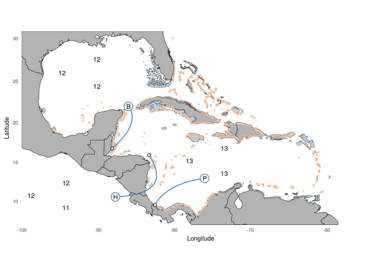
3.2.2 Fig. 1 B)
Next we create the sub figure containing the FST information (Fig. 1 B). We first read in the data and define the color palette.
fstdata <- read.csv('../../2_output/08_popGen/05_fst/genome_wide_weighted_mean_fst.txt',
                    sep='\t',skip = 1,head=F,col.names = c('pair','fst')) %>%
  filter(!pair %in% c('NU','PN','PU')) %>%
  arrange(fst) %>%
  mutate(x=row_number()) %>%
  rowwise() %>%
  mutate(loc = substr(as.character(pair),2,2),
         pop1 = substr(as.character(pair),1,1),
         pop2 = substr(as.character(pair),3,3),
         pairclass=paste(pop1,pop2,sep='-'))

# defining the pairwise color palette
clrP <- c('#1b519c','#fb8620','#d93327')
And than generate the bar plot:
p5 <- ggplot(fstdata,aes(x=x,y=fst,fill=pairclass))+
  # bar layer
  geom_bar(stat='identity')+
  # adding annotations
  annotation_custom(legPGrob,xmin =0.15,xmax =5,ymin =.008,ymax = .035)+
  # set color palette
  scale_fill_manual(values = clrP)+
  # y label and axis
  scale_y_continuous(name=expression(italic("F"['ST'])),
                     expand = c(0,0))+
  # x labels and axis
  scale_x_continuous(expand = c(.01,0),breaks = 1:9,
                     labels = c('H','H','B','H','P','B','B','P','P'))+
  # preset theme
  theme_mapK+
  # theme adjustments
  theme(legend.position = 'none',
        panel.grid.major.y = element_line(color=rgb(.9,.9,.9)),
        axis.title.x = element_blank(),
        axis.text.x = element_text(size = 8));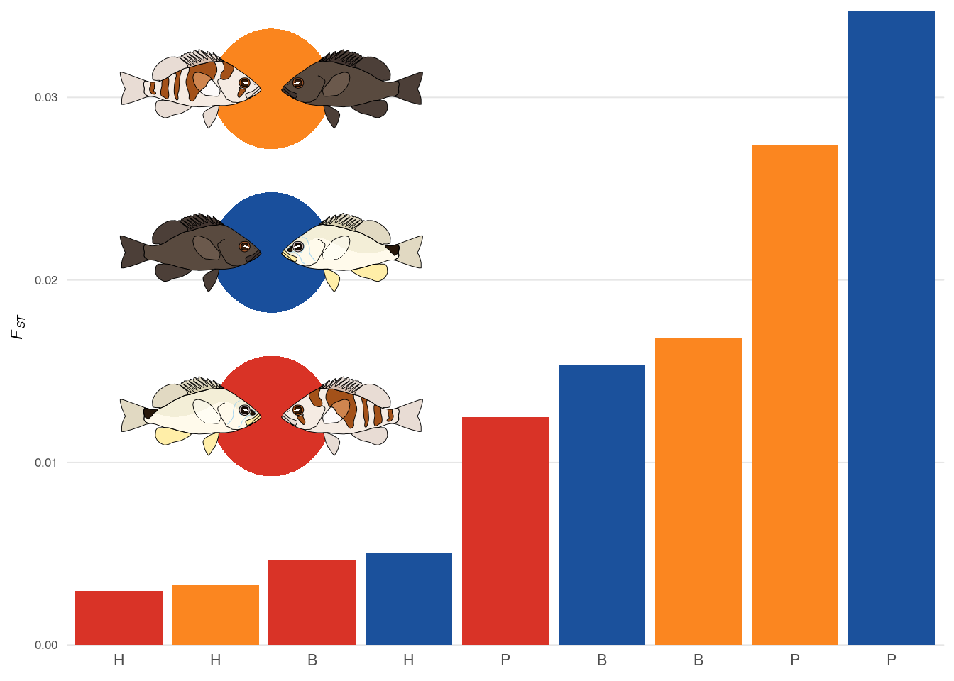
3.2.3 Fig. 1 C)
The last sub figure contains the PCA output for each location. For those, we define the color palette for hamlet species and read in the PCA data generated by pcadapt.
clr<-c('#000000','#d45500','#000000')
fll<-c('#000000','#d45500','#ffffff')
eVclr <- c(rep('darkred',2),rep(cFILL,8))

# Belize data
belPCA <- readRDS('../../2_output/08_popGen/04_pca/bel/belpca.Rds')
# Honduras data
honPCA <- readRDS('../../2_output/08_popGen/04_pca/hon/honpca.Rds')
# Panama data
panPCA <- readRDS('../../2_output/08_popGen/04_pca/pan/panpca.Rds')
The data for each PCA is merged with metadata about the samples and than plotted. Further, the explained variance of each PC is extracted for the axis labels.
# Honduras PCA (data)
dataHON <- cbind(dataAll %>% filter(sample=='sample',loc=='hon')%>% select(id,spec),
                 honPCA$scores); names(dataHON)[3:12]<- paste('PC',1:10,sep='')
exp_varHON <- (honPCA$singular.values[1:10])^2/length(honPCA$maf)
xlabHON <- paste('PC1 (',sprintf("%.1f",exp_varHON[1]*100),'%)')# explained varinace)')
ylabHON <- paste('PC2 (',sprintf("%.1f",exp_varHON[2]*100),'%)')# explained varinace)')

# Honduras PCA (plot)
p2 <- ggplot(dataHON,aes(x=PC1,y=PC2,col=spec,fill=spec))+geom_point(size=1.1,shape=21)+
  scale_color_manual(values=clr,guide=F)+
  ggtitle('Honduras')+
  scale_fill_manual(values=fll,guide=F)+theme_mapK+
  theme(legend.position='bottom',plot.title = element_text(size = 11,hjust = .45),
        panel.border = element_rect(color=rgb(.9,.9,.9),fill=rgb(1,1,1,0)),
        axis.title.y = element_text(vjust = -7),
        axis.title.x = element_text(vjust = 6),
        plot.margin = unit(rep(-10,4),'pt'))+#coord_equal()+
  scale_x_continuous(name=xlabHON,breaks = c(-.2,.5))+
  scale_y_continuous(name=ylabHON,breaks = c(-.4,.2))
# Belize PCA (data)
dataBEL <- cbind(dataAll %>% filter(sample=='sample',loc=='bel') %>% select(id,spec),
belPCA$scores); names(dataBEL)[3:12]<- paste('PC',1:10,sep='')
exp_varBEL <- (belPCA$singular.values[1:10])^2/length(belPCA$maf)
xlabBEL <- paste('PC1 (',sprintf("%.1f",exp_varBEL[1]*100),'%)')
ylabBEL <- paste('PC2 (',sprintf("%.1f",exp_varBEL[2]*100),'%)')
# Belize PCA (plot)
p3 <- ggplot(dataBEL,aes(x=PC1,y=PC2,col=spec,fill=spec))+geom_point(size=1.1,shape=21)+
scale_color_manual(values=clr,guide=F)+
ggtitle('Belize')+
scale_fill_manual(values=fll,guide=F)+theme_mapK+
theme(legend.position='bottom',plot.title = element_text(size = 11,hjust = .45),
panel.border = element_rect(color=rgb(.9,.9,.9),fill=rgb(1,1,1,0)),
axis.title.y = element_text(vjust = -7),
axis.title.x = element_text(vjust = 6),
plot.margin = unit(rep(-10,4),'pt'))+
scale_x_continuous(name=xlabBEL,breaks = c(-.15,.25))+
scale_y_continuous(name=ylabBEL,breaks = c(-.3,.2))# Panama PCA (data)
dataPAN <- cbind(dataAll %>% filter(sample=='sample',loc=='boc',spec!='gum')%>% select(id,spec),
panPCA$scores); names(dataPAN)[3:12]<- paste('PC',1:10,sep='')
exp_varPAN <- (panPCA$singular.values[1:10])^2/length(panPCA$maf)
xlabPAN <- paste('PC1 (',sprintf("%.1f",exp_varPAN[1]*100),'%)')
ylabPAN <- paste('PC2 (',sprintf("%.1f",exp_varPAN[2]*100),'%)')
# Panama PCA (plot)
p4 <- ggplot(dataPAN,aes(x=PC1,y=PC2,col=spec,fill=spec))+geom_point(size=1.1,shape=21)+
scale_color_manual(values=clr,guide=F)+
ggtitle('Panama')+
scale_fill_manual(values=fll,guide=F)+theme_mapK+
theme(legend.position='bottom',plot.title = element_text(size = 11,hjust = .45),
panel.border = element_rect(color=rgb(.9,.9,.9),fill=rgb(1,1,1,0)),
axis.title.y = element_text(vjust = -7),
axis.title.x = element_text(vjust = 6),
plot.margin = unit(rep(-10,4),'pt'))+
scale_x_continuous(name=xlabPAN,breaks = c(-.15,.2))+
scale_y_continuous(name=ylabPAN,breaks = c(-.2,.2))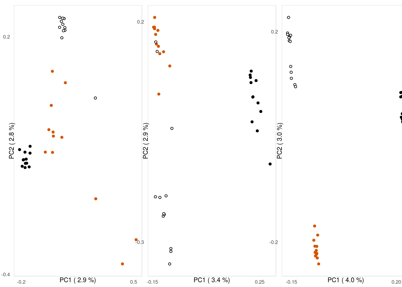
3.2.4 Fig 1 (complete)
Finally, we have all the pieces and can put together Fig. 1.
We need a few helper variables for the placing and scaling of the annotations:
# scaling (x,y)
hSC <- c(.07,.07)
# hamlet placing (within group)
yf <- c(0.07,0.035,0.00);xf<-c(0.07,0,0.07)
# hamlet group placing
yS <- c(.485,.577,.805);xS<-c(.09,.417,.156)
Using ggdraw() form the cowplot package, the figure is put together.
F1 <- ggdraw()+
  # include subplots
  draw_plot(plot = p1,0,.38,.81,.64)+
  draw_plot(plot = p5,0,.01,.24,.35)+
  draw_plot(plot = p2,.25,.01,.23,.37)+
  draw_plot(plot = p3,.5,.01,.23,.37)+
  draw_plot(plot = p4,.75,.01,.23,.37)+
  # annotations (legend)
  draw_grob(legGrob, .375,.395,.65,.65)+
  # annotations (compas)
  draw_grob(compGrob, 0.605, 0.482, 0.06, 0.06)+
  # annotations (hamlets)
  draw_grob(nigGrob, xf[1]+xS[1], yf[1]+yS[1], hSC[1], hSC[2])+ # Honduras
  draw_grob(pueGrob, xf[2]+xS[1], yf[2]+yS[1], hSC[1], hSC[2])+ # Honduras
  draw_grob(uniGrob, xf[3]+xS[1], yf[3]+yS[1], hSC[1], hSC[2])+ # Honduras

  draw_grob(nigGrob, xf[1]+xS[2], yf[1]+yS[2], hSC[1], hSC[2])+ # Panama
  draw_grob(pueGrob, xf[2]+xS[2], yf[2]+yS[2], hSC[1], hSC[2])+ # Panama
  draw_grob(uniGrob, xf[3]+xS[2], yf[3]+yS[2], hSC[1], hSC[2])+ # Panama

  draw_grob(nigGrob, xf[1]+xS[3], yf[1]+yS[3], hSC[1], hSC[2])+ # Belize
  draw_grob(pueGrob, xf[2]+xS[3], yf[2]+yS[3], hSC[1], hSC[2])+ # Belize
  draw_grob(uniGrob, xf[3]+xS[3], yf[3]+yS[3], hSC[1], hSC[2])+ # Belize
  # annotations (flags)
  draw_grob(panGrob, 0.3, 0.485, 0.042, 0.042)+
  draw_grob(belGrob, 0.2, 0.67, 0.042, 0.042)+
  draw_grob(honGrob, 0.28, 0.61, 0.042, 0.042)+

  draw_grob(honGrob, 0.285, 0.37, 0.042, 0.042)+
  draw_grob(belGrob, 0.535, 0.37, 0.042, 0.042)+
  draw_grob(panGrob, 0.785, 0.37, 0.042, 0.042)+
  # annotations (subfigure labels)
  draw_plot_label(x = c(.001,.001,.24),
                  y = c(.99,.42,.42),
                  label = letters[1:3])
It is then exported using ggsave().
ggsave(plot = F1,filename = '../output/F1.pdf',width = 183,height = 145,units = 'mm',device = cairo_pdf)