11 Supplementary Figure 06
11.1 Summary
This is the accessory documentation of Supplementary Figure 06.
The Figure can be recreated by running the R script S06.R:
cd $WORK/3_figures/F_scripts

Rscript --vanilla S06.R
rm Rplots.pdf
11.2 Details of S06.R
In the following, the individual steps of the R script are documented. Is an executable R script that depends on a variety of image manipulation and data managing packages. The main workhorse of the expression analysis is the R package DESeq2.
library(tidyverse)
library(cowplot)
library(tximport)
library(DESeq2)
library(vsn)
library(gplots)
library(ggforce)
library(grid)
library(gridSVG)
library(grImport2)
library(grConvert)
# defining a small string clipping function
clp <- function(x){y<-substr(x,2,nchar(x));y}
11.2.1 Suppl. Fig. 06 A)
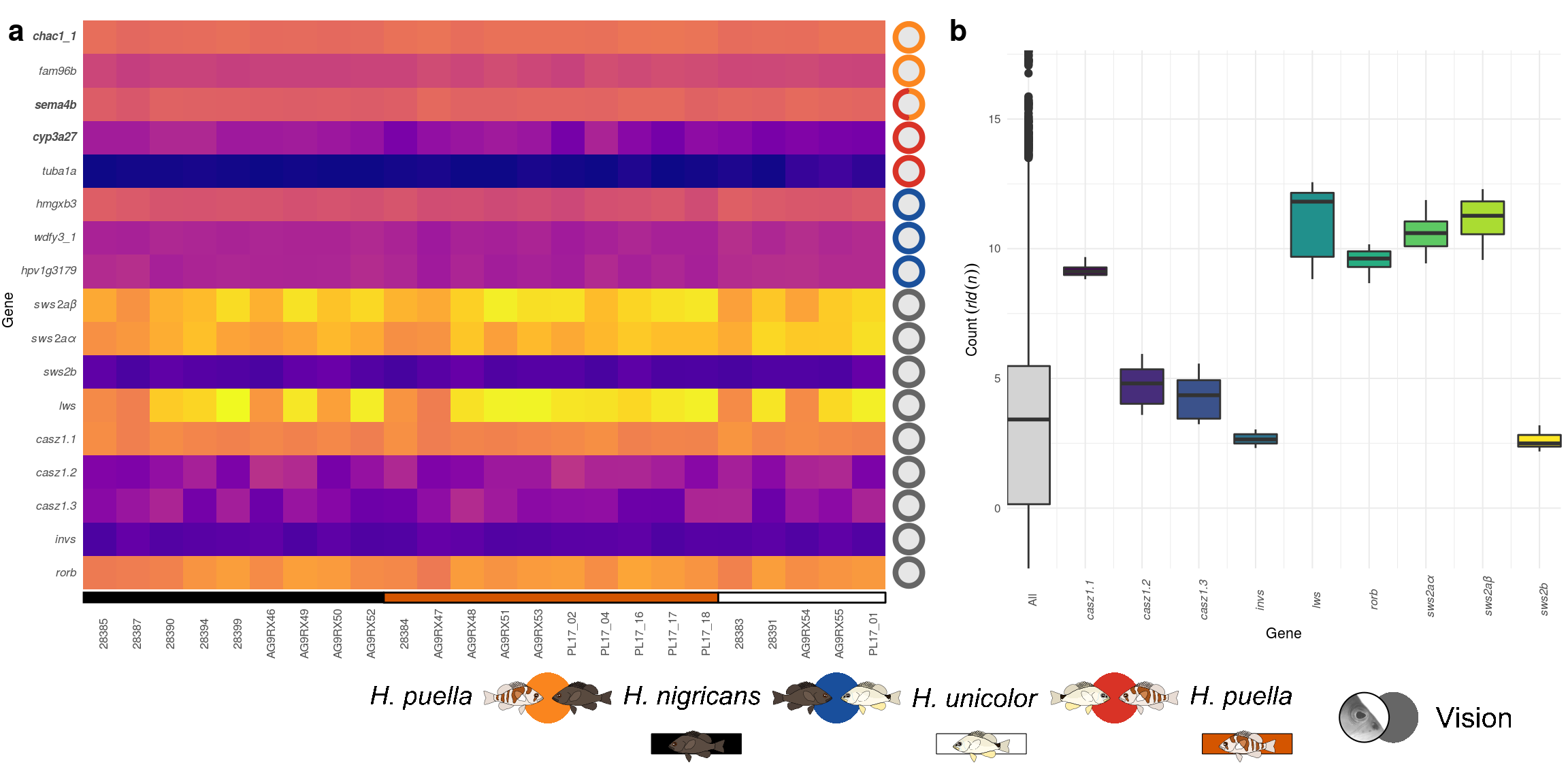
First, the base path of the kallisto results is set and one sub-path per sample is generated.
base_dir <- "../../2_output/09_expression/kallisto/"
samples <- substr(dir(base_dir),10,nchar(dir(base_dir)))
kal_dirs <- sapply(samples, function(id) file.path(base_dir, paste("kallisto_",id,sep='')))
Then, metadata containing the assignment of samples into populations is loaded and added to the kallisto sub-paths.
pops <- read.csv('../../0_data/0_resources/retina_samples_ID.txt',sep='\t')[1:24,] %>% mutate(pop=substr(population,4,6))
s2c <- data.frame(path=kal_dirs, sample=samples, population = pops$pop, stringsAsFactors=FALSE)
A helper table connection gene names with transcript IDs is loaded, as well as a redundant sample ID table inherited from earlier versions of this script.
t2g <- read.csv('../../0_data/0_resources/transcripts2genname.txt',sep='\t',stringsAsFactors = F)
retDesign <- read.csv('../../0_data/0_resources/retina_samples_ID_altVersion.csv',sep='\t',row.names=1)
Then, the actual kallisto results are imported.
txi.kallisto <- tximport(paste(kal_dirs,"/abundance.tsv",sep=''),
                         type = "kallisto", txOut=T,tx2gene = t2g,
                         geneIdCol="transcripts2genname.txt")
Selected columns of the kallisto data are transformed into a data.frame object.
testdf <- data.frame(abund = row.names(txi.kallisto$abundance),
                     count = row.names(txi.kallisto$counts),
                     length=row.names(txi.kallisto$length),
                     t1=t2g$target_id,
                     t2=t2g$HPgene) %>% mutate(check = (abund!=count)+(abund!=length)+(abund!=t1))
The row names of the kallisto results are changed from transcript Id to gene name.
row.names(txi.kallisto$abundance) <- t2g$HPgene
row.names(txi.kallisto$counts) <- t2g$HPgene
row.names(txi.kallisto$length) <- t2g$HPgene
Population information is retrieved from the metadata table and the standard differential expression analysis of DESeq2is run.
samples <- pops%>%select(rID,pop);row.names(samples) <- samples$rID
dds <- DESeqDataSetFromTximport(txi.kallisto, samples, ~pop)
dds <- DESeq(dds)
Since we have three different contrasts (species pairs), three copies of the analysis are generated and each one is ordered according to the adjusted p value of a different contrast.
res <- list()
res[[1]] <- results(dds,contrast = c("pop","pue","nig"))
res[[1]] <- res[[1]][order(res[[1]]$padj),]

res[[2]] <- results(dds,contrast = c("pop","pue","uni"))
res[[2]] <- res[[2]][order(res[[2]]$padj),]

res[[3]] <- results(dds,contrast = c("pop","nig","uni"))
res[[3]] <- res[[3]][order(res[[3]]$padj),]
Defining genes to be plotted and subset the differential expression analysis to only those genes.
selGene <- c(rownames(res[[1]])[1:3],
             rownames(res[[3]])[1:3],
             rownames(res[[2]])[1:3],
             "SWS2abeta","SWS2aalpha","SWS2b","LWS",
             "Casz1_2-1","Casz1_2-2","Casz1_2-3","invs",
             "RORB")

select <- (counts(dds,normalized=TRUE) %>% rownames()) %in% selGene
Setting the color map of the plot.
hmcol <- colorRampPalette(viridis::plasma(9))(100)Defining a small table for the species annotation.
annodat <- data.frame(xmin=c(.5,9.5,19.5),
                      xmax=c(9.5,19.5,24.5),
                      ymin=rep(.1,3),
                      ymax=rep(.4,3),
                      clr=c('black',"#d45500",'black'),
                      fll=c('black',"#d45500",'white'))
The count data is transformed using the regularized log transformation implemented in DESeq2.
rld <- rlogTransformation(dds, blind=TRUE)Then the transformed results are stored within a data.frame object,arranged according to species and the order of the genes is set.
testdat <- as.data.frame(assay(rld)[select,order(retDesign$population)])%>%
  tibble::rownames_to_column(var = 'gene') %>%
  gather(.,key = 'sample',value = 'counts',2:25)

ordS <- retDesign %>% tibble::rownames_to_column(var = 'Sample') %>% arrange(population)

testdat$sample <- factor(as.character(testdat$sample),levels = ordS$Sample)
testdat$gene <- factor(as.character(testdat$gene),levels =rev(selGene[!duplicated(selGene)]))
The source of interest concerning the selected genes (significant in one of the three contrasts, candidate gene) is stored in a table that is later used for annotation.
d2 <- data.frame(name = factor(rev(selGene[!duplicated(selGene)]),
                               levels=rev(selGene[!duplicated(selGene)])))

d3 <- left_join(data.frame(name=selGene,comp=c(rep('np',3),rep('nu',3),
                                               rep('pu',3),rep('vision',9))),d2,by='name') %>%
  group_by(name) %>% mutate(n = 1/length(comp),s=(row_number()-1)/2*2*pi,e=s+n*2*pi) %>%
  ungroup() %>% mutate(name = as.character(name),clr=c('#fb8620','#d93327','#1b519c','#333333')[as.numeric(comp)])

d3$name <- factor(d3$name,levels=rev(selGene[!duplicated(selGene)]))
testdat <- testdat %>% mutate(lab = tolower(gene))
testdat$sample <- factor(clp(as.character(testdat$sample)),levels=clp(levels(testdat$sample)))
Custom labels for the y axis are generated.
YL <- expression(italic("rorb"),italic("invs"),
                 italic("casz1.3"),
                 italic("casz1.2"),italic("casz1.1"),italic("lws"),
                 italic("sws2b"),italic(paste(sws2a,"\u03B1")),
                 italic(paste(sws2a,"\u03B2")),italic("hpv1g3179"),
                 italic("wdfy3_1"),italic("hmgxb3"),italic("tuba1a"),
        bolditalic("cyp3a27"),bolditalic("sema4b"),italic("fam96b"),bolditalic("chac1_1"))
Finally the heat map of sub figure Supplementary Figure 06 a is plotted.
p2 <- ggplot(testdat,aes(x=sample,y=gene,fill=counts))+
  # adding the transformed count data
  geom_tile()+coord_equal(xlim = c(0.5,26.1))+
  # addiing the species annotation
  geom_rect(inherit.aes = F,data=annodat,
       aes(xmin=xmin,xmax=xmax,ymin=ymin,ymax=ymax),col='black',fill=annodat$fll)+
  # adding the 'gene type' annotation
  geom_circle(inherit.aes = F,data=d2, aes(x0 = 25.2,y0=as.numeric(name),r=.4),fill=rgb(.9,.9,.9))+
  # adding the 'gene type' annotation (continued)
  geom_arc(inherit.aes = F,
           aes(x0 = 25.2,y0 = as.numeric(as.factor(name)), r = .4, start = s, end = e,col=comp),size=1.5,
           data = d3)+
  # formatting the axes and color map
  scale_x_discrete(name='',expand = c(0,0))+
  scale_y_discrete(name='Gene',labels=YL)+
  viridis::scale_fill_viridis(name="Expression: ",option = 'C',
                              guide = guide_colorbar(direction = "horizontal",title.position = "top"))+
  scale_color_manual(name="",values=c('#fb8620','#d93327','#1b519c','#666666'),guide=F)+
  # general plot theme
  theme_minimal(base_size = 8)+
  theme(axis.text.x = element_text(angle=90),
        plot.margin = unit(c(1,1,50,1),'pt'),
        axis.text.y =  element_text(face = 'italic'),
        legend.position = c(.02,-.4),panel.grid = element_blank(),legend.key.width = unit(20,'pt'))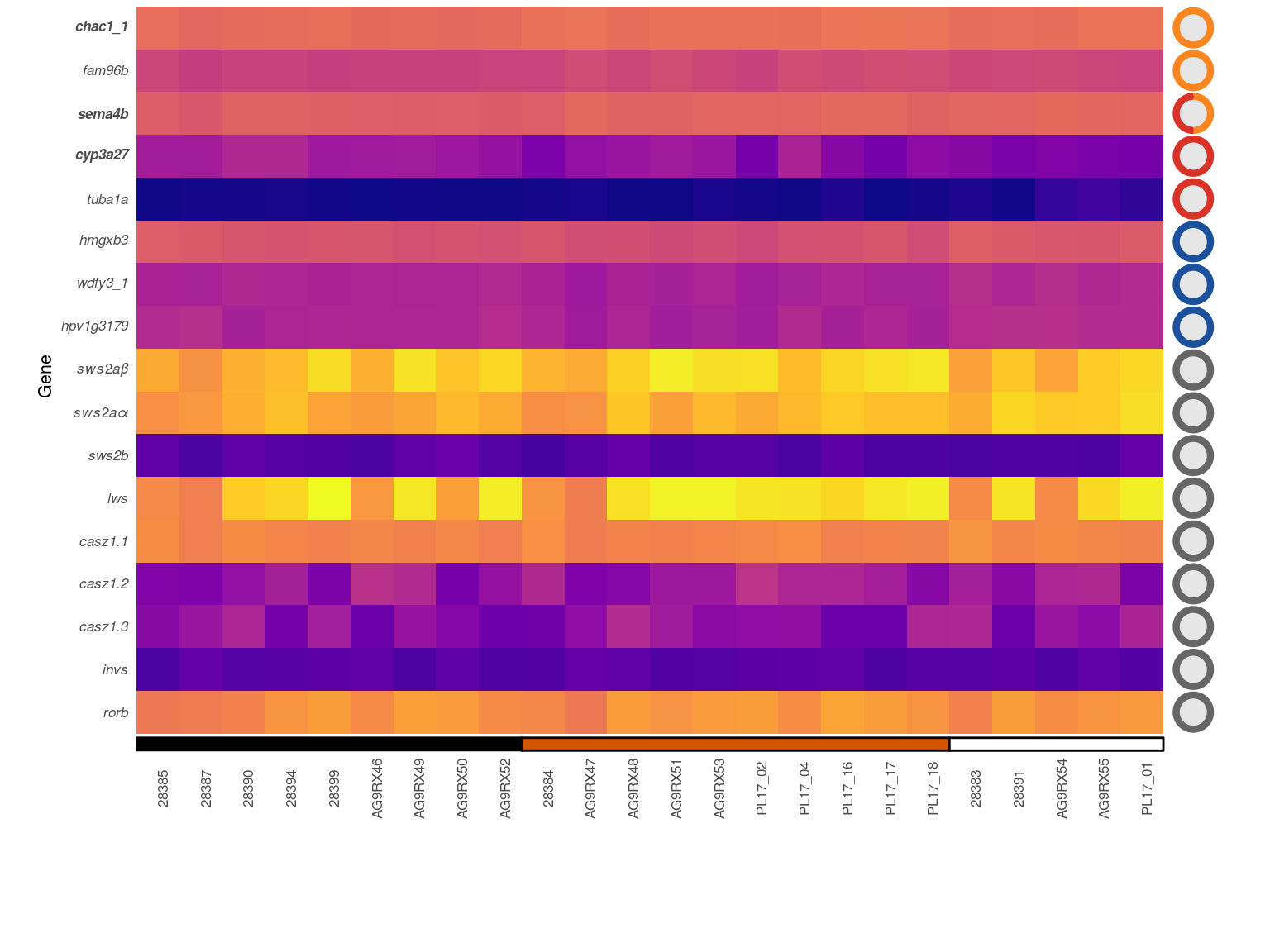
11.2.2 Suppl. Fig. 06 B)
To judge the expression level and variance of the candidate genes, the transformed count data is additionally plotted as box plot and compared with the complete data set.
The complete results of the log. transformed data is stored in a data.frame and the candidate genes are defined. This is data is then used for the overall distribution of the transformed counts data.
Cdf3 <- as.data.frame(assay(rld)[,order(retDesign$population)]) %>%
  tibble::rownames_to_column(var = 'gene') %>%
  gather(key = "Sample",value = "Count",R28385:RPL17_01)

selGene2 <- c("SWS2abeta","SWS2aalpha","SWS2b","LWS",
             "Casz1_2-1","Casz1_2-2","Casz1_2-3",
             "invs","RORB")
A second data.frame is created for only the candidate genes.
Cgenes2 <- as.data.frame(assay(rld)[,order(retDesign$population)]) %>%
  tibble::rownames_to_column(var = 'gene') %>%
  filter(gene %in% selGene2) %>%
  gather(key = "Sample",value = "Count",R28385:RPL17_01)
Custom labels for the x axis are generated.
Flab <- expression("All",italic("casz1.1"),italic("casz1.2"),italic("casz1.3"),
                   italic("invs"),italic("lws"),italic("rorb"),
                   italic(paste("  sws2a","\u03B1")),italic(paste("  sws2a","\u03B2")),italic("sws2b"))
Finally the box plots of sub figure Supplementary Figure 06 b are plotted.
p3 <- ggplot(Cdf3,aes(x=0,y=Count))+
  # adding the boxplot of the complete data set
  geom_boxplot(aes(fill='all'))+
  # adding the boxplots of the genes of interest
  geom_boxplot(inherit.aes = F,
               data=Cgenes2,
               aes(x=as.numeric(as.factor(gene)),y=Count,
                   group=gene,fill=gene))+
  # formatting the axes and color map
  scale_x_continuous('Gene',expand=c(0,0),breaks=0:9,labels=Flab)+
  scale_y_continuous(expression(Count~(italic(rld(n)))),expand=c(0,0))+
  scale_fill_manual('Gene',values = c('lightgray',viridis::viridis(9)),
                    labels=Flab)+
  # general plot theme
  theme_minimal(base_size = 8)+
  theme(legend.position = 'none',
        axis.text.x = element_text(angle=90))
External images are loaded for annotation.
legGrob <- gTree(children=gList(pictureGrob(readPicture("../../0_data/0_img/legend-expression-cairo.svg"))))Using ggdraw() form the cowplot package, the figure is put together.
S06 <- ggdraw()+
  draw_plot(p2,0,0,.6,1)+
  draw_plot(p3,.61,.17,.39,.775)+
  draw_grob(legGrob, 0.2, 0, 0.8, 0.17)+
  draw_plot_label(x=c(0,.6),y=c(.99,.99),label = c('a','b'))
It is then exported using ggsave().
ggsave(plot = S06, filename = '../output/S06.pdf',width=183,height=90,units = 'mm',device = cairo_pdf)