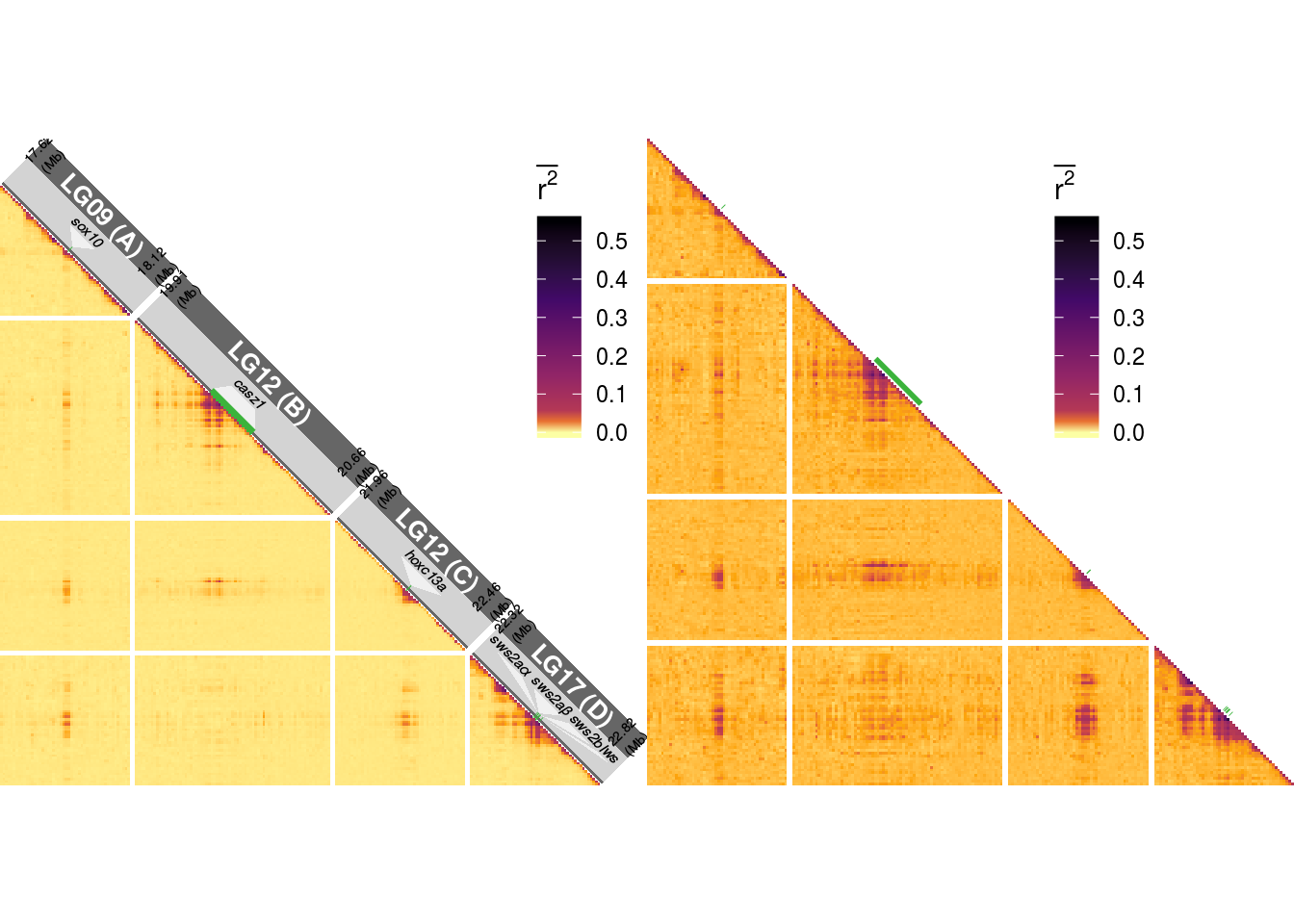
6 Figure 4
6.1 Summary
This is the accessory documentation of Figure 4.
The Figure can be recreated by running the R script F4.R:
cd $WORK/3_figures/F_scripts

Rscript --vanilla F4.R
rm Rplots.pdf
6.2 Details of F4.R
In the following, the individual steps of the R script are documented. Is an executable R script that depends on a variety of image manipulation and data managing and genomic data packages.
It Furthermore depends on the R scripts F4.functions.R,F4.genomeWide_box.R and F4.peakArea_box.R (all located under $WORK/0_data/0_scripts).
library(tidyverse)
library(scales)
library(cowplot)
library(grid)
library(gridSVG)
library(grImport2)
source('../../0_data/0_scripts/F4.functions.R')
The script F4.functions.Rcontains a function (trplot()) that plots a single LD triangle as seen in Figure 4. The Details of this script are explained below. The output depends on the data set plotted (sub figure a contains additional annotations).
We create an empty list that is then filled with the subplots using the trplot() function.
plts <- list()
for(k in 1:7){
  plts[[k]] <- trplot(k)
}
An individual result will look like this (plts[[1]] & plts[[2]]):
The basic plots are transformed into grid obgects. These are afterwards rotated by 45 degrees.
tN <- theme(legend.position = 'none')
pG1 <- ggplotGrob(plts[[1]]+tN)
pG2 <- ggplotGrob(plts[[2]]+tN)
pG3 <- ggplotGrob(plts[[3]]+tN)
pG4 <- ggplotGrob(plts[[4]]+tN)
pG5 <- ggplotGrob(plts[[5]]+tN)
pG6 <- ggplotGrob(plts[[6]]+tN)
pG7 <- ggplotGrob(plts[[7]]+tN)

pGr1 <- editGrob(pG1, vp=viewport(x=0.5, y=0.91, angle=45,width = .7), name="pG1")
pGr2 <- editGrob(pG2, vp=viewport(x=0.25, y=0.535, angle=45,width = .28), name="pG2")
pGr3 <- editGrob(pG3, vp=viewport(x=0.25, y=0.352, angle=45,width = .28), name="pG3")
pGr4 <- editGrob(pG4, vp=viewport(x=0.25, y=0.17, angle=45,width = .28), name="pG4")
pGr5 <- editGrob(pG5, vp=viewport(x=0.75, y=0.535, angle=45,width = .28), name="pG5")
pGr6 <- editGrob(pG6, vp=viewport(x=0.75, y=0.352, angle=45,width = .28), name="pG5")
pGr7 <- editGrob(pG7, vp=viewport(x=0.75, y=0.17, angle=45,width = .28), name="pG5")
Then, the data for the box plots are loaded and plotted within external scripts.
source('../../0_data/0_scripts/F4.genomeWide_box.R')
source('../../0_data/0_scripts/F4.peakArea_box.R')
Additional annotations are generated and external annotations loaded. Then, variables used for placing the annotations are generated.
pGRAD <- ggplot(data = data.frame(x=c(0,1,-1,0),
                                  y=c(0,15,15,0)),
                aes(x,y))+geom_polygon(fill='lightgray')+coord_equal()+theme_void()

nigGrob <- gTree(children=gList(pictureGrob(readPicture("../../0_data/0_img/nigricans-cairo.svg"))))
pueGrob <- gTree(children=gList(pictureGrob(readPicture("../../0_data/0_img/puella-cairo.svg"))))
uniGrob <- gTree(children=gList(pictureGrob(readPicture("../../0_data/0_img/unicolor-cairo.svg"))))

belGrob <- gTree(children=gList(pictureGrob(readPicture("../../0_data/0_img/belize-cairo.svg"))))
honGrob <- gTree(children=gList(pictureGrob(readPicture("../../0_data/0_img/honduras-cairo.svg"))))
panGrob <- gTree(children=gList(pictureGrob(readPicture("../../0_data/0_img/panama-cairo.svg"))))
globGrob <- gTree(children=gList(pictureGrob(readPicture("../../0_data/0_img/caribbean-cairo.svg"))))

leg <- get_legend(plts[[1]]+theme(legend.direction = 'horizontal',legend.key.width = unit(60,'pt')))
sY <- .035;
sX <- -.03;
Finally, the complete Figure 4 is put together.
F4 <- ggdraw(pGr1)+
  draw_plot(pBOX,-.1,.54,.45,.21)+
  draw_plot(boxGenes,.65,.54,.45,.21)+
  draw_plot(pGRAD,.307,-.018,.16,.53)+
  draw_grob(pGr2,0,0,1,1)+
  draw_grob(leg,-.33,.22,1,1)+
  draw_grob(pGr3,0,0,1,1)+
  draw_grob(pGr4,0,0,1,1)+
  draw_grob(pGr5,0,0,1,1)+
  draw_grob(pGr6,0,0,1,1)+
  draw_grob(pGr7,0,0,1,1)+
  draw_grob(nigGrob, 0.85, 0.38, 0.12, 0.095)+
  draw_grob(pueGrob, 0.85, 0.2, 0.12, 0.095)+
  draw_grob(uniGrob, 0.85, 0, 0.12, 0.095)+
  draw_grob(panGrob, 0.35+sX+.01, 0.37+sY, 0.12, 0.045)+
  draw_grob(belGrob, 0.35+sX+.01, 0.19+sY, 0.12, 0.045)+
  draw_grob(honGrob, 0.35+sX, 0+sY, 0.14, 0.045)+
  draw_grob(globGrob, 0.06, .925, 0.08, 0.08)+
  draw_plot_label(letters[1:5],
                  x = c(rep(0.01,2),.87,0.01,.54),
                  y=c(.99,.81,.81,.57,.57),
                  size = 14)
The final figure is then exported using ggsave().
ggsave(plot = F4,filename = '../output/F4.png',width = 183,height = 235,units = 'mm',dpi = 150)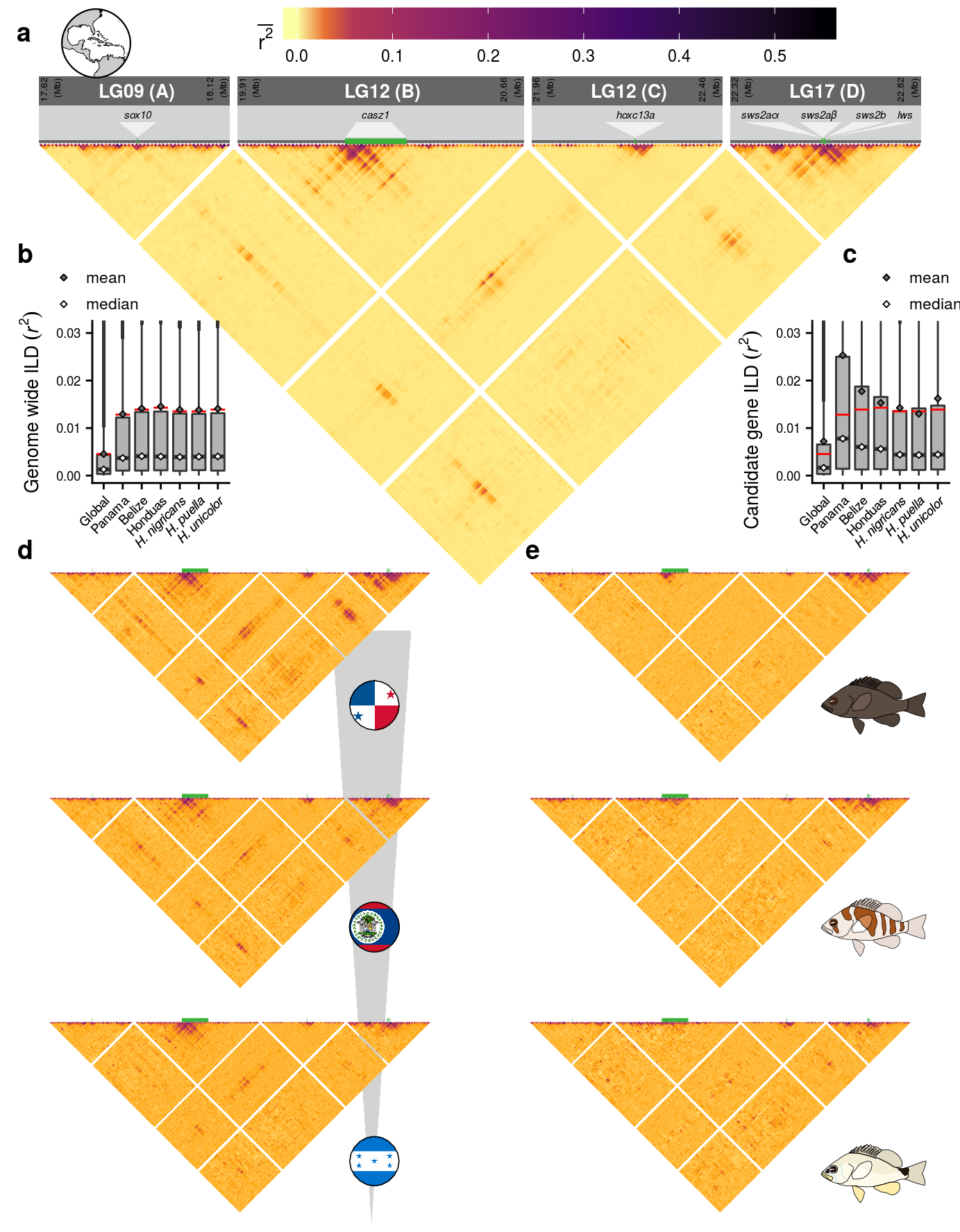
6.3 Details of F4.functions.R
The script first defines a function for standard error
se <-  function(x){
  x2 <- x[!is.na(x)]
  return(sd(x2)/sqrt(length(x2)))}
And then the plotting function for the LD triangles is defined. Within the trplot() function the sel parameter specifies the selected data set. Then, a lot of annotation elements are generated, data is transformed to match the triangle layout of the plot and the base plot is created.
trplot <- function(sel){
  # the inventory of LD data files
  files <- c("global","boc","bel","hon","pue","nig","uni","nig-pue","nig-uni","pue-uni")
  # reading in the LD data
  data <- read.csv(paste('../../2_output/08_popGen/07_LD/',files[sel],'-10000-bins.txt',sep=''),sep='\t')
  # confirm selection
  message(files[sel])
The genomic positions (start, end, length and spacing between) of the ranges of interest are stored.
  s1=17620000;s2=19910000;s3=21960000;s4=22320000;
  e2=20660000;e3=22460000;
  stp=20000;
  l1=500000;l2=750000;l3=500000;l4=500000
Then we define a vector containing the x-shift needed to transform the positions of the candidate genes on the respective LGs into the transformed x-axis of the LD triangles
scling <- c(-s1,-s2+(l1+stp),-s3+(l1+l2+2*stp),-s4+(l1+l2+l3+(stp*3)))The LD data is read in and positions are transformed.
dt <- data %>% mutate(miX = floor(Mx/10000),miY=floor(My/10000))We generate a data frame that includes the gene positions (taken from the annotation file) the respective entry in our scale transformation vector, the LG and gene name. The genomic positions are then transformed.
  genes <- data.frame(start=c(17871610,20186151,22225149,22553187,22556763,22561894,22573388),
                      end=c(17873915,20347811,22228342,22555052,22559742,22566321,22575503),
                      sclr=c(1,2,3,4,4,4,4),
                      LG=c("LG09","LG12-1","LG12-2","LG17","LG17","LG17","LG17"),
                      name=c("sox10",'casz1',"hoxc13a","sws2a\u03B1","sws2a\u03B2","sws2b","lws"))
  genes <- genes %>% mutate(Nx1 = (start+scling[sclr])/10000,Nx2 = (end+scling[sclr])/10000,
                            labPOS = (Nx1+Nx2)/2)
The position of some of the gene labels need shifting to avoid overlapping.
genes$labPOS[genes$name %in% c("sws2a\u03B1","sws2a\u03B2","sws2b","lws")] <- genes$labPOS[genes$name %in% c("sws2a\u03B1","sws2a\u03B2","sws2b","lws")]+c(-16,-1,12,20)Then we define a data frame for the polygons that zoom onto the gene position within the annotation/legend of sub figure a.
  GZrS <- 40000;GZrS2 <- 20000; #gene zoom offset
  BS <- c(-5,5,-4,3,-8,8,-20,-10,-6,5,7,16,17,22)*10000 # Backshifter for gene zoom
  GZdf <- data.frame(x=c(genes$start[1],genes$end[1],genes$end[1]+GZrS+BS[1],genes$start[1]+GZrS+BS[2],genes$start[1],
                         genes$start[2],genes$end[2],genes$end[2]+GZrS+BS[3],genes$start[2]+GZrS+BS[4],genes$start[2],
                         genes$start[3],genes$end[3],genes$end[3]+GZrS+BS[5],genes$start[3]+GZrS+BS[6],genes$start[3],
                         genes$start[4],genes$end[4],genes$end[4]+GZrS+BS[7],genes$start[4]+GZrS+BS[8],genes$start[4],
                         genes$start[5],genes$end[5],genes$end[5]+GZrS+BS[9],genes$start[5]+GZrS+BS[10],genes$start[5],
                         genes$start[6],genes$end[6],genes$end[6]+GZrS+BS[11],genes$start[6]+GZrS+BS[12],genes$start[6],
                         genes$start[7],genes$end[7],genes$end[7]+GZrS+BS[13],genes$start[7]+GZrS+BS[14],genes$start[7])+GZrS2,
                     y=c(genes$start[1],genes$end[1],genes$end[1]-GZrS+BS[1],genes$start[1]-GZrS+BS[2],genes$start[1],
                         genes$start[2],genes$end[2],genes$end[2]-GZrS+BS[3],genes$start[2]-GZrS+BS[4],genes$start[2],
                         genes$start[3],genes$end[3],genes$end[3]-GZrS+BS[5],genes$start[3]-GZrS+BS[6],genes$start[3],
                         genes$start[4],genes$end[4],genes$end[4]-GZrS+BS[7],genes$start[4]-GZrS+BS[8],genes$start[4],
                         genes$start[5],genes$end[5],genes$end[5]-GZrS+BS[9],genes$start[5]-GZrS+BS[10],genes$start[5],
                         genes$start[6],genes$end[6],genes$end[6]-GZrS+BS[11],genes$start[6]-GZrS+BS[12],genes$start[6],
                         genes$start[7],genes$end[7],genes$end[7]-GZrS+BS[13],genes$start[7]-GZrS+BS[14],genes$start[7])-GZrS2,
                     grp=rep(letters[1:7],each=5)) %>%
    mutate(sclr=rep(c(1,2,3,4,4,4,4),each=5),
           Nx1 = (x+scling[sclr])/10000,
           Nx2 = (y+scling[sclr])/10000)
Some parameters are set for plotting (base colors for the LD color gradient, gene annotation color, zoom color and y offsets for LG labels, LG background and gene-axis).
  clr = c(viridis::inferno(5)[c(1,1:5)])
  Gcol <- '#3bb33b'
  Zcol = rgb(.94,.94,.94)
  DG <- rgb(.4,.4,.4)
  LGoffset <- 15
  GLABoffset <- 8
At this point, the data set selection is checked. If the current selection is the global data set, the additional annotation is included.
if(sel %in% c(1,8)){For the additional annotation, several helpers are needed and defined as data frames. The construction of these is obscured by the fact that in the base plot, the later horizontal bands are plotted tilted by an angle of 45 degrees. Therefore, a simple y offset affects both x and y axis in the base plot.
    rS <- 100000 # width of grey annotation band
    zmRange <- data.frame(x=c(s1,s1+l1,s1+l1+rS,s1+rS,s1,
                              s2,s2+l2,s2+l2+rS,s2+rS,s2,
                              s3,s3+l3,s3+l3+rS,s3+rS,s3,
                              s4,s4+l4,s4+l4+rS,s4+rS,s4),
                          y=c(s1,s1+l1,s1+l1-rS,s1-rS,s1,
                              s2,s2+l2,s2+l2-rS,s2-rS,s2,
                              s3,s3+l3,s3+l3-rS,s3-rS,s3,
                              s4,s4+l4,s4+l4-rS,s4-rS,s4),
                          grp=rep(letters[1:4],each=5)) %>%
      mutate(sclr=rep(1:4,each=5),
             Nx1 = (x+scling[sclr])/10000-1,
             Nx2 = (y+scling[sclr])/10000)

    rS2 <- .75*rS # width of dark grey LG label band
    zmRange2 <- data.frame(x=c(s1,s1+l1,s1+l1+rS2,s1+rS2,s1,
                               s2,s2+l2,s2+l2+rS2,s2+rS2,s2,
                               s3,s3+l3,s3+l3+rS2,s3+rS2,s3,
                               s4,s4+l4,s4+l4+rS2,s4+rS2,s4),
                           y=c(s1,s1+l1,s1+l1-rS2,s1-rS2,s1,
                               s2,s2+l2,s2+l2-rS2,s2-rS2,s2,
                               s3,s3+l3,s3+l3-rS2,s3-rS2,s3,
                               s4,s4+l4,s4+l4-rS2,s4-rS2,s4),
                           grp=rep(letters[1:4],each=5)) %>%
      mutate(sclr=rep(1:4,each=5),
             Nx1 = (x+scling[sclr])/10000-1,
             Nx2 = (y+scling[sclr])/10000)

    rS3 <- .07*rS # width of dark grey gene axis
    zmRange3 <- data.frame(x=c(s1,s1+l1,s1+l1+rS3,s1+rS3,s1,
                               s2,s2+l2,s2+l2+rS3,s2+rS3,s2,
                               s3,s3+l3,s3+l3+rS3,s3+rS3,s3,
                               s4,s4+l4,s4+l4+rS3,s4+rS3,s4),
                           y=c(s1,s1+l1,s1+l1-rS3,s1-rS3,s1,
                               s2,s2+l2,s2+l2-rS3,s2-rS3,s2,
                               s3,s3+l3,s3+l3-rS3,s3-rS3,s3,
                               s4,s4+l4,s4+l4-rS3,s4-rS3,s4),
                           grp=rep(letters[1:4],each=5)) %>%
      mutate(sclr=rep(1:4,each=5),
             Nx1 = (x+scling[sclr])/10000-1,
             Nx2 = (y+scling[sclr])/10000)
Then one data frame is defined containing the LG labels and positions and another one containing the borders of the genomic regions.
    zmLab <- data.frame(x=c(s1+.5*l1,s2+.5*l2,s3+.5*l3,s4+.5*l4),
                        label=c('LG09 (A)','LG12 (B)','LG12 (C)','LG17 (D)')) %>%
      mutate(sclr=1:4, Nx= (x+scling[sclr])/10000)

    zmEND <- data.frame(x=c(s1,s1+l1,
                            s2,s2+l2,
                            s3,s3+l3,
                            s4,s4+l4)) %>%
      mutate(sclr=rep(1:4,each=2),
             Nx = ((x+scling[sclr])/10000)+rep(c(2.5,-4),4),
             label=round((x/1000000),2))
Three vectors containing text sizes (adjusted to Figure 4 & Suppl. Figure 12) are created.
    textSCALE1 <- c(1.8,rep(NA,6),.7)
    textSCALE2 <- c(2,rep(NA,6),1)
    textSCALE3 <- c(3.5,rep(NA,6),1.75)
Then, the base plot is created and stored in p1.
      # the data set is filtered to remove missing values
      p1 <- ggplot(dt %>% filter(!is.na(Mval)),aes(fill=Mval))+
        # the aspect ratio of x and y scale needs to be fixed to 1:1
        coord_equal()+
        # adding the light gray band highlighting the genomic ganges
        geom_polygon(inherit.aes = F,data=zmRange,
                     aes(x=Nx1+1,y=Nx2-1,group=grp),fill='lightgray')+
        # adding the dark gray background of the LG labels
        geom_polygon(inherit.aes = F,data=zmRange2,
                     aes(x=Nx1+11,y=Nx2-11,group=grp),fill=DG)+
        # adding the dark gray gene axis
        geom_polygon(inherit.aes = F,data=zmRange3,
                     aes(x=Nx1+1.1,y=Nx2-1.1,group=grp),fill=DG)+
         # adding the light gene zoom polygons
        geom_polygon(inherit.aes = F,data=GZdf,
                     aes(x=Nx1,y=Nx2,group=grp),fill=Zcol)+
        # adding green gene highlights
        geom_segment(inherit.aes = F,data=genes,
                     aes(x=Nx1+1,y=Nx1-1,xend=Nx2+1,yend=Nx2-1),
                     col=Gcol,size=1.5)+
        # adding LD data
        geom_tile(aes(x=miX,y=miY))+
        # adding labels for genomic range labels
        geom_text(inherit.aes = F,data=zmEND,
                  aes(x=Nx+LGoffset,y=Nx-LGoffset,label=paste(label,'\n(Mb)')),
                  angle=45,size=textSCALE1[sel])+
        # adding gene labels
        geom_text(inherit.aes = F,data=genes,
                  aes(x=labPOS+GLABoffset,y=labPOS-GLABoffset,label=name),
                  angle=-45,fontface='italic',size=textSCALE2[sel])+
        # adding LG labels
        geom_text(inherit.aes = F,data=zmLab,
                  aes(x=Nx+LGoffset-.8,y=Nx-LGoffset+.8,label=label),
                  angle=-45,fontface='bold',size=textSCALE3[sel],col='white')+
        # format x and y axis
        scale_x_continuous(expand=c(0,0))+
        scale_y_continuous(expand=c(0,0),
                           trans = 'reverse')+
        # plot layout theme
        theme_void()+
        theme(legend.position = c(.7,.75),legend.direction = 'vertical')
If the current selection is not the global data set, the only the base triangle is plotted.
  } else {
    # the data set is filtered to remove missing values
    p1 <- ggplot(dt %>% filter(!is.na(Mval)),aes(fill=Mval))+
      # the aspect ratio of x and y scale needs to be fixed to 1:1
      coord_equal()+
      # adding green gene highlights
      geom_segment(inherit.aes = F,data=genes,
                   aes(x=Nx1+1.5,y=Nx1-1.5,xend=Nx2+1.5,yend=Nx2-1.5),
                   col=Gcol,size=1)+
      # adding LD data
      geom_tile(aes(x=miX,y=miY))+
      # format x and y axis
      scale_x_continuous(expand=c(0,0))+
      scale_y_continuous(expand=c(0,0),
                         trans = 'reverse')+
      # plotting layout theme
      theme_void()+
      theme(legend.position = c(.7,.75),legend.direction = 'vertical')

  }
Finally, the genreal color paletee is set and the function returns the current base plot stored in p1.
  cs <- scale_fill_viridis_c(name=expression(bar(r^2)),
                             limits = c(0,0.55),values = c(0,.08,1),
                             option =  'B',direction = -1)

  return(p1+cs)
}
The script F4.functions.R contains a second helper function which is used for the box plots. This function retuns a set of summary statistics for the r^2 distributions:
run_one_sample_test <- function(pop,n,data){
  df <- data %>%
    filter(run == pop)
  x <- df$R.2 %>% na.omit() %>% as.vector()

  exp_mu <- 1/(2*n)
  test_result <- wilcox.test(x,mu = exp_mu)

  return(tibble(population = pop,
                mean = x %>% mean,
                sd = x %>% sd,
                se = x %>% se,
                var = x %>% var,
                n = length(x),
                exp_mu = exp_mu) %>% bind_cols(
                test_result %>% broom::tidy()))
}
6.4 Details of F4.genomeWide_box.R
Within this script, the ILD data of the genome wide subsets of SNPs is loaded and and plotted.
First we read in the global data set, then we loop over the individual population subsets and append the data to the global data set. Since we’re only interested in the distribution of r[2], we select only this column and create extra columns for the run ID, and the run type (global, subset by species, subset by location)
BW <- read.csv('../../2_output/08_popGen/07_LD/subsets/glob_between.interchrom.hap.ld',sep='\t') %>%
  select(R.2) %>%
  mutate(type='Global',run='Global')

for(j in 1:6){
  flS <- c("boc","bel","hon","pue","nig","uni")
  flL <- c("Panana","Belize","Honduras","H. puella","H. nigricans","H. unicolor")
  flT <- c(rep('Geo',3),rep('Spec',3))
  k <- flS[j]
  q <- flL[j]
  u <- flT[j]
  print(j)
  BW <- BW %>%
    rbind(.,(read.csv(paste('../../2_output/08_popGen/07_LD/subsets/glob_between.',k,'.interchrom.hap.ld',sep=''),
                      sep='\t') %>%
               select(R.2) %>%
               mutate(type=u,run=q)))
}
Then, we arrange the order of the runs.
BW$run <- factor(BW$run,levels=c('Global',"Panana","Belize","Honduras",
                                 "H. nigricans","H. puella","H. unicolor"))
To be able to include the mean values to the box plots we create a small summary table of the LD data.
dt2 <- BW %>%
  group_by(run) %>%
  summarise(meanR2=mean(R.2,na.rm = T),medR2=median(R.2,na.rm = T)) %>%
  gather(key = 'type',value = 'val',2:3)
The the colors for the plot are set.
BC <-rgb(.7,.7,.7)
clr <-colorRampPalette(colors = c('white',BC,'black'))(8)
We run the summary statistics on the data (basically only to generate the expected mean r^2).
# tests
locations <- c('Global',"Panana","Belize","Honduras","H. puella","H. nigricans","H. unicolor")
sample_sizes <- c(110,39,36,35,37,37,36)
test_gw <- purrr::map2(locations,sample_sizes,run_one_sample_test,data=BW) %>% bind_rows()

test_gw$xS <- factor(test_gw$population,
                     levels = c('Global',"Panana","Belize","Honduras",
                                "H. nigricans","H. puella","H. unicolor")) %>%
  as.numeric()
And finally , the data is plotted.
# initializing the plot
pBOX <- ggplot(BW,aes(x=run,y=R.2))+
  # adding box plots
  geom_boxplot(fill=BC,width=.7,outlier.size = .1)+
  # set a fixed aspect ratio
  coord_fixed(ylim=c(0,.031),ratio = 250)+
  # adding expected mean value
  geom_segment(inherit.aes = FALSE,data=test_gw,
               aes(x=xS-.38,xend=xS+.38,y=exp_mu,yend=exp_mu),
               col='red',size=.5)+
  # adding mean and median values
  geom_point(inherit.aes = F, data=dt2,aes(x=run,y=val,fill=type),shape=23,size=1)+
  # settting the axis and color labels
  scale_x_discrete(labels = expression(Global,Panama,Belize,Honduas,
                                       italic("H. nigricans"),italic("H. puella"),italic("H. unicolor")))+
  scale_y_continuous(name=expression(genome~wide~ILD~(italic(r)^2)))+
  scale_fill_manual('',values = clr[c(6,1)],labels=c('mean','median'))+
  # formatting the legend
  guides(shape = guide_legend(ncol = 1))+
  # adjusting the plot theme
  theme(legend.position = c(-.4,1.27),
        text = element_text(size=10),
        axis.title.x = element_blank(),
        axis.text.y = element_text(size=7),
        axis.text.x = element_text(size=7,angle=45,hjust = 1),
        panel.background = element_blank(),
        plot.background = element_blank())
6.5 Details of F4.peakArea_box.R
Within this script, the ILD data of the peak area subsets of SNPs is loaded and and plotted.
First, we loop over the individual runs and combine them into a single data set. Since we’re only interested in the distribution of r^2, we select only this column and create extra columns for the run ID, and the run type (global, subset by species, subset by location)
dataBoxGenes <- data.frame(R.2=c(),run=c(),stringsAsFactors = F)

for (file in dir("../../2_output/08_popGen/07_LD/",pattern = "interchrom.hap.ld.gz")) {
  nm <- str_remove_all(file, "spotlight.") %>% str_remove_all(.,".interchrom.hap.ld.gz")
  if(nm %in% c("global","uni","pue","nig","hon","bel","boc")){
    dataBoxGenes <- read.csv(gzfile(paste('../../2_output/08_popGen/07_LD/',file,sep='')),sep='\t') %>%
      mutate(run = nm) %>%
      select(R.2,run) %>%
      rbind(dataBoxGenes,.)
  }
}
Then, we arrange the order of the runs.
dataBoxGenes$xS <- factor(dataBoxGenes$run,
                          levels = c("global","boc","bel","hon","nig","pue","uni"))
To be able to include the mean values to the box plots we create a small summary table of the LD data.
BoxGenes_summary <- dataBoxGenes %>%
  group_by(xS) %>%
  summarise(run = run[1],
            meanR2 = mean(R.2,na.rm = T),
            medR2 = median(R.2,na.rm = T),
            sdR2 = sd(R.2,na.rm=T),
            seR2 = se(R.2),
            nanr = sum(is.na(R.2)),
            minR2 = min(R.2,na.rm = T),
            maxR2 = max(R.2,na.rm = T),
            lengthR2 = length(R.2)) %>%
  select(xS,meanR2,medR2) %>%
  gather(key = 'type',value = 'val',2:3)
We run the summary statistics on the data (basically only to generate the expected mean r^2).
# tests
locations <- c("global","boc","bel","hon","nig","pue","uni")
sample_sizes <- c(110,39,36,35,37,37,36)
test_area <- purrr::map2(locations,sample_sizes,run_one_sample_test,data=dataBoxGenes) %>%
  bind_rows()

test_area$xS <- factor(test_area$population,
                          levels = c("global","boc","bel","hon","nig","pue","uni")) %>%
  as.numeric()
And finally , the data is plotted.
# initializing the plot
boxGenes <- ggplot(dataBoxGenes,aes(x=xS))+
  # adding box plots
  geom_boxplot(aes(y=R.2),fill=BC,width=.7,outlier.size = .1) +
  # adding mean and median values
  geom_point(data=BoxGenes_summary,aes(y=val,fill=type),shape=23,size=1)+
  # set a fixed aspect ratio
  coord_fixed(ylim=c(0,.031),ratio = 133)+
  # adding expected mean value
  geom_segment(inherit.aes = FALSE,data=test_gw,
               aes(x=xS-.38,xend=xS+.38,y=exp_mu,yend=exp_mu),
               col='red',size=.5)+
  # settting the axis and color labels
  scale_y_continuous(expression(candidate~gene~ILD~(italic(r)^2)))+
  scale_x_discrete(labels = expression(Global,Panama,Belize,Honduas,
                                       italic("H. nigricans"),italic("H. puella"),italic("H. unicolor")))+
  scale_fill_manual('',values = clr[c(6,1)],labels=c('mean','median'))+
  # formatting the legend
  guides(shape = guide_legend(ncol = 1))+
  # adjusting the plot theme
  theme(legend.position = c(.35,1.27),
        text = element_text(size=10),
        axis.title.x = element_blank(),
        axis.title.y = element_text(hjust=1.25),
        axis.text.y = element_text(size=7),
        axis.text.x = element_text(size=7,angle=45,hjust = 1),
        panel.background = element_blank(),
        plot.background = element_blank())