Twin package pt1 - hypogen
R package to ease working with genomic data of hamlets
What: R package
R:
Over the last years in the Puebla lab I spent quite some time on the analysis of genetic data of Caribbean Hamlets. During this time I kept rewriting the same type of R code over and over again.
After the publication of the study Inter-chromosomal coupling between vision and pigmentation genes during genomic divergence, I wanted to formalize these bits and pieces and wrote two small packages - hypogen and hypoimg.
The first (hypogen) one is a collection of all the code snippets related to genetics of hamlets, while the second one (hypoimg) deals with code related to graphical annotaion of plots using hamlet images.
This is the first of two blog entries presenting the bysic functionality of these packages.
Hypogen
The main focus of hypogen is the import and visualization of genetic data mapped to the hamlet reference genome.
library(tidyverse)
library(hypogen)
Import data
Often when working with genetic data we have a set of markers for which we want to display a specific statistic.
This might come as a dataset that includes the chromosome the marker is placed on, the marker position and the statistics (eg. FST).
The package hypogen provides the function hypo_import_snps() to easily import this type of data and add the genomic context of the marker (the genomic start of the chromosome and the genomic position of the marker):
system('echo "CHROM\tPOS\tVALUE\nLG05\t10\t2" > test.tsv')
hypogen::hypo_import_snps('test.tsv')
## # A tibble: 1 x 5
##   CHROM   POS VALUE    GSTART      GPOS
##   <chr> <dbl> <dbl>     <dbl>     <dbl>
## 1 LG05     10     2 105714998 105715008
Another classic type of data is a summary of a genomic window (eg. a sliding window analysis).
This data can be imported using the function hypo_import_windows().
system('echo "CHROM\tBIN_START\tBIN_END\tVALUE\nLG05\t10\t15\t2\nLG18\t1000\t1500\t4" > test.tsv')
hypogen::hypo_import_windows('test.tsv')
## # A tibble: 2 x 7
##   CHROM BIN_START BIN_END VALUE    GSTART    POS       GPOS
##   <chr>     <dbl>   <dbl> <dbl>     <dbl>  <dbl>      <dbl>
## 1 LG05         10      15     2 105714998   12.5 105715010.
## 2 LG18       1000    1500     4 421775982 1250   421777232
system('rm test.tsv')
Apart from this data import functions, a sumary of the hamlet genome assembly is stored within the dataset hypo_karyotype.
hypogen::hypo_karyotype %>%
  head() %>%
  knitr::kable(align = 'ccccc')
| CHROM | LENGTH | GSTART | GEND | GROUP |
|---|---|---|---|---|
| LG01 | 25890264 | 0 | 25890264 | odd |
| LG02 | 31702000 | 25890264 | 57592264 | even |
| LG03 | 23122023 | 57592264 | 80714287 | odd |
| LG04 | 25000711 | 80714287 | 105714998 | even |
| LG05 | 20912025 | 105714998 | 126627023 | odd |
| LG06 | 24210077 | 126627023 | 150837100 | even |
Plot data
A second focus of the package is to provide help with data visualization along the hamlet genome within the ggplot2 framework.
To indicate the individual linkage groups (LG), the function geom_hypo_LG() can be used in combination with scale_fill_hypo_LG_bg().
The function scale_x_hypo_LG() will adjust the ticks of the x-axis to indicate the LG number.
ggplot()+
  coord_cartesian(ylim = c(0, 1))+
  geom_hypo_LG() +
  scale_fill_hypo_LG_bg()+
  scale_x_hypo_LG()+
  theme_hypo()+
  theme(axis.title.y = element_blank(),
        axis.text.y = element_blank())
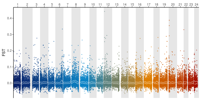
As an example, we can plot some RAD data published by Puebla et al. (2014). The data was mapped onto the hamlet genome and re-analysed using STACKS (Catchen et al. 2013).
loci_pos <- read_tsv("stacks/batch_2.phistats.tsv", skip = 4)  %>%
    mutate( CHROM =
              str_replace(Chr, pattern = 'chr', replacement = 'LG')) %>%
    select( `Locus ID`, CHROM,BP ) %>%
    filter( grepl('LG', CHROM) ) %>%
    left_join(hypo_chrom_start) %>%
    mutate(GPOS = BP + GSTART )

global_fst <- read_tsv('stacks/Fst_SPEC_genepop.tsv') %>%
  setNames(.,nm = c('Locus ID', 'FIS', 'FST', 'FIT')) %>%
  left_join( loci_pos ) %>%
  filter( !is.na(CHROM)) %>%
  mutate( window = 'global_fst')
Now, we can plot the RAD data in the context of the hamlet genome.
global_fst %>%
  ggplot(aes(x = GPOS, y = FST))+
  geom_hypo_LG() +
  geom_point(aes( color = CHROM ), alpha = .6, size = .3) +
  geom_smooth(aes(group = CHROM), color = rgb(1, 1, 1, .6),
              se = FALSE, size = 2,method = 'loess', span = .2)+
  geom_smooth(aes(color = CHROM, group = CHROM),
              se = FALSE, method = 'loess', span = .2)+
  scale_fill_hypo_LG_bg()+
  scale_x_hypo_LG()+
  scale_color_hypo_LG(guide = FALSE)+
  theme_hypo()
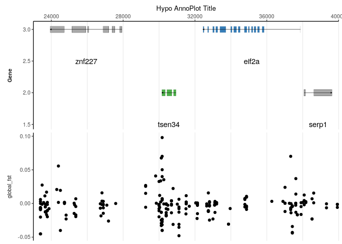
Besides plotting genome wide data, the package hypogen provides methods to plot data in the context of the genome annotation. For this, we first select a specific LG and define a range of interest.
LG <- "LG09"
XR <- c(200000, 275000)
anno_data <- global_fst %>% filter(CHROM == LG , BP > XR[1], BP < XR[2])
clr <- c('darkgray', RColorBrewer::brewer.pal(3, 'Set1')[c(1,3)])
Then, we plot the data subset together with the genome annotation.
hypo_annotation_baseplot(searchLG = LG, xrange = XR,
                         genes_of_interest = "AKT3_0",
                         genes_of_sec_interest = "Pus10",
                         anno_rown = 2) +
  geom_point(data = anno_data, aes(x = BP, y = FST), size=.5) +
  coord_cartesian(xlim = XR) +
  facet_grid(window~., scales = 'free_y',
             switch = 'y', labeller = label_parsed) +
  scale_color_manual(values = c('black', 'gray', clr), guide = FALSE) +
  scale_fill_manual(values = clr, guide = FALSE) +
  scale_x_continuous(name = "Hypo AnnoPlot Title",
                     expand = c(0, 0),position = 'top') +
  theme_hypo() +
  theme_hypo_anno_extra()
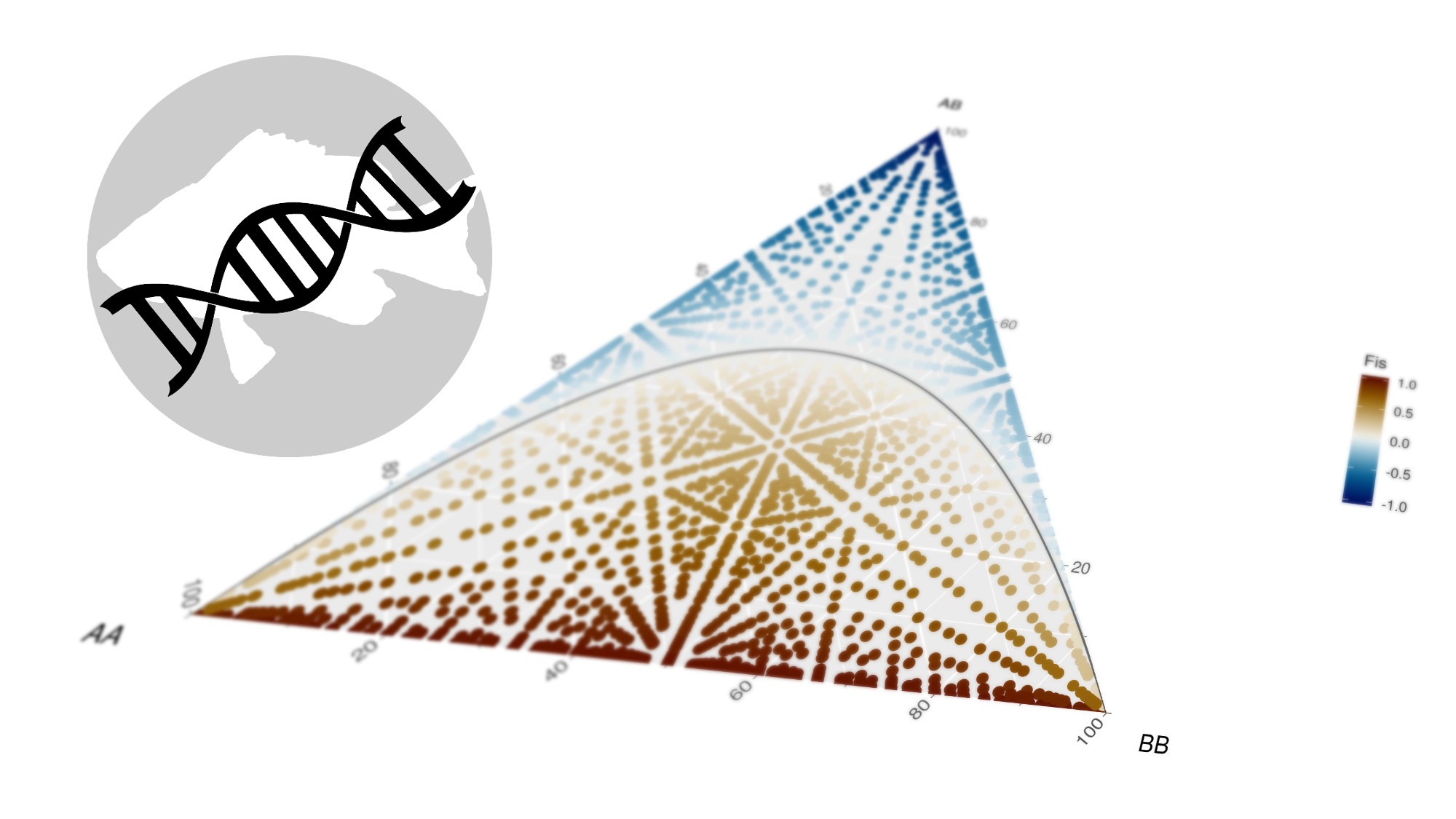
Genotype frequencies
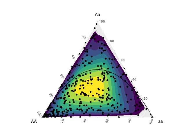
The last feature of the hypogen package is the use of ternary diagrams for genotype frequencies. This is done to control for heterozygote excess or deficit.
The implementation of ternary diagrams within the ggplot2 framework is done using the ggtern package.
library(ggtern)
The genotypes of the data should be coded AA/Aa/aa:
n <- 350

data <- tibble(AA = runif(n)) %>%
  mutate(aa = (1-AA)*runif(n),
         Aa = 1-AA-aa)

data %>%
  head() %>%
  knitr::kable()
| AA | Aa | aa |
|---|---|---|
| 0.7620661 | 0.0660756 | 0.1718583 |
| 0.4350251 | 0.1445212 | 0.4204537 |
| 0.5044092 | 0.3341618 | 0.1614290 |
| 0.0365411 | 0.6628914 | 0.3005675 |
| 0.8947430 | 0.0148808 | 0.0903762 |
| 0.4489359 | 0.1179725 | 0.4330917 |
As reference, the function hypo_hwe() can be used to indicate the genotype frequencies that are in Hardy–Weinberg equilibrium.
hypogen::hypo_hwe(n = 25) %>%
  ggplot(aes(x = AA, y = Aa, z = aa )) +
  coord_tern() +
  ggtern::stat_density_tern(data = data,
        geom='polygon',
        aes(fill=..level..))+
  geom_point(data = data) +
  geom_line()+
  scale_fill_viridis_c(guide = FALSE)
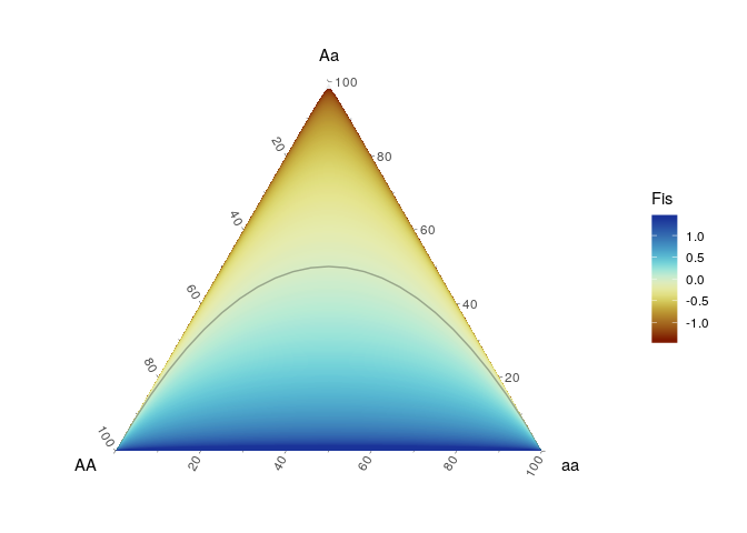
We can use this for example to demonstate the development of the inbreeding coefficient (FIS) across the genotype frequencies space.
nmax <- 15
sq <- 0:nmax
cross_df(list(AA = sq, Aa = sq, aa = sq)) %>%
  mutate(n = AA+Aa+aa) %>%
  filter(n == nmax) %>%
  mutate( p = (AA+.5*Aa)/n,
          q = (aa+.5*Aa)/n,
          He = 2*p*q,
          Ho = Aa/n,
          Fis = ifelse(Aa > 0,((He - Ho)/(He)),1)) %>%
  ggplot(aes(x = AA, y = Aa, z = aa )) +
  coord_tern() +
  stat_interpolate_tern(geom = "polygon",
                     formula = value~x+y, method = lm, n = 200,
                     breaks=seq(-1.4, 1.4, length.out = 500),
                     aes( value = Fis, fill = ..level..), expand=10)+
  geom_line(data = hypogen::hypo_hwe(n = 25),color=rgb(0,0,0,.3))+
  scico::scale_fill_scico('Fis',palette = 'roma')
References
Catchen, Julian, Paul A. Hohenlohe, Susan Bassham, Angel Amores, and William A. Cresko. 2013. “Stacks: An Analysis Tool Set for Population Genomics.” Molecular Ecology 22 (11): 3124–40. https://doi.org/10.1111/mec.12354.
Puebla, O., E. Bermingham, and W. O. McMillan. 2014. “Genomic Atolls of Differentiation in Coral Reef Fishes (Hypoplectrus Spp., Serranidae).” Molecular Ecology 23 (21): 5291–5303. https://doi.org/10.1111/mec.12926.