Twin package pt2 - hypoimg
R package to annotate plots with hamlet comics
What: R package
R: Over the last years in the Puebla lab I spent quite some time on the analysis of genetic data of Caribbean Hamlets. During this time I kept rewriting the same type of R code over and over again.
After the publication of the study Inter-chromosomal coupling between vision and pigmentation genes during genomic divergence, I wanted to formalize these bits and pieces and wrote two small packages - hypogen and hypoimg.
The first (hypogen) one is a collection of all the code snippets related to genetics of hamlets, while the second one (hypoimg) deals with code related to graphical annotaion of plots using hamlet images.
This is the second of two blog entries presenting the bysic functionality of these packages.
Hypoimg
The main task of hypoimg is to provide the hamlet images for the illustration of hamlet related plots. Besides this, the package also provides an import function for other images in svg format and some image manipulation functions.
library(tidyverse)
library(gganimate)
library(hypoimg)
Basic idea
As stated before, the main task of hypoimg is to provide hamlet illustrations.
In its most basic form, this would be the hamlet outline which is stored as x and y
values within the tibble hypoimg::hypo_outline.
Here, I use this data set to let R draw a fish using the gganimate package.
plot_data <- hypoimg::hypo_outline
clr <- scico::scico(9,palette = 'roma')[c(1:9,8:1)]

anim <- ggplot(plot_data, aes(x, y)) +
  coord_equal() +
  geom_path(data = plot_data %>% mutate(frm = row_number()),
            aes(color = frm), size = 1.5) +
  geom_point(data = plot_data %>% mutate(frm = row_number()),
             shape = 21, aes(fill = frm), size = 2)+
  scale_color_gradientn(colours = clr, guide = FALSE)+
  scale_fill_gradientn(colours = clr, guide = FALSE)+
  scale_x_continuous(expand = c(0.01,0.01))+
  scale_y_continuous(expand = c(0.01,0.01))+
  theme_void()+
  # Here comes the gganimate code
  transition_reveal(frm) +
  ease_aes('cubic-in-out')

anim

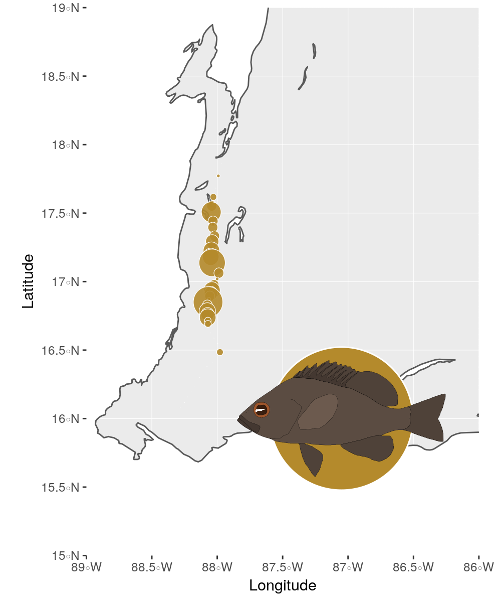
The package also provides illustrations of all currently described hamlet species which can be used to decorate plots within the ggplot framework.
Here, I plot all the sampling locations of the black hamlets (Hypoplectrus nigricans) from Puebla, Bermingham, and McMillan (2012) at the coast of Belize. For the coastline we need the two natural earth packages, for plotting spatial objects the sf package and to plot the circles we use ggforce.
library(rnaturalearth)
library(rnaturalearthdata)
library(ggforce)
library(sf)
Then, we import the sampling locations from the study and transform the locations to decimal degrees.
data <- read_tsv("https://www.datadryad.org/bitstream/handle/10255/dryad.40060/Surveys.txt?sequence=1") %>%
  mutate(Latitude = Latitude %>% str_replace(.,'\xa1 ','-') %>%   str_remove(.,"'N"),
         Longitude = Longitude %>% str_replace(.,'\xa1 ','-') %>%   str_remove(.,"'W")) %>%
  separate(Latitude, into = c('lat1', 'lat2'),sep = '-', convert = TRUE) %>%
  separate(Longitude, into = c('lon1', 'lon2'),sep = '-', convert = TRUE) %>%
  mutate(Latitude = lat1+lat2/60,
         Longitude = -(lon1+lon2/60)) %>%
  select(Longitude, Latitude, `H. nigricans`)
Now, we prepare the spatial extent of our map, load the landmasses and the coastline and clip them to only cover that area.
# function to crop sf objects to the plotting area
crp <- function(poly){
  st_intersection(poly,
                  st_set_crs(st_as_sf(as(raster::extent(-89, -86, 15, 19), "SpatialPolygons")), st_crs(poly)))
}

world <- ne_countries(scale = "large", returnclass = "sf") %>% crp()
coast <- ne_coastline(scale = 'large', returnclass = "sf") %>% crp()
Finally, we plot the map and the sampling locations.
To add the hamlet illustration, we use the hypoimg function
hypo_anno_single() within the annotation_custom() from ggplot2.
ggplot()+
  geom_sf(data = world, fill = 'white', color = 'white')+
  geom_sf(data = coast) +
  annotation_custom(grob = (hypo_anno_single('nigricans',
                                             circle_fill = "#B48A2C",
                                             circle_color = 'white') %>% ggplotGrob()),
                    xmin = -89, xmax = -85.1, ymin = 15,ymax = 17) +
  geom_circle(data = data ,
              aes(x0 = Longitude, y0 = Latitude, r = `H. nigricans`/80),
              color = 'white',
              fill = "#B48A2C",
              size = .2,
              alpha = .9) +
  coord_sf(xlim = c(-89, -86),
           ylim = c(15, 19))+
  scale_x_continuous(expand = c(0, 0))+
  scale_y_continuous(expand = c(0, 0))
The geom_hypo_grob() function
One nice feature of ggplot2 is the possibility to separate subplots based on
a certain variable within the data using either facet_grid() or facet_wrap().
Yet, this is not possible for annotations - when using annotation_custom() this
illustration will be used for all subplots.
To be able to vary the illustrations over the subplots, hypoimg provides the
geom_hypo_grob() function.
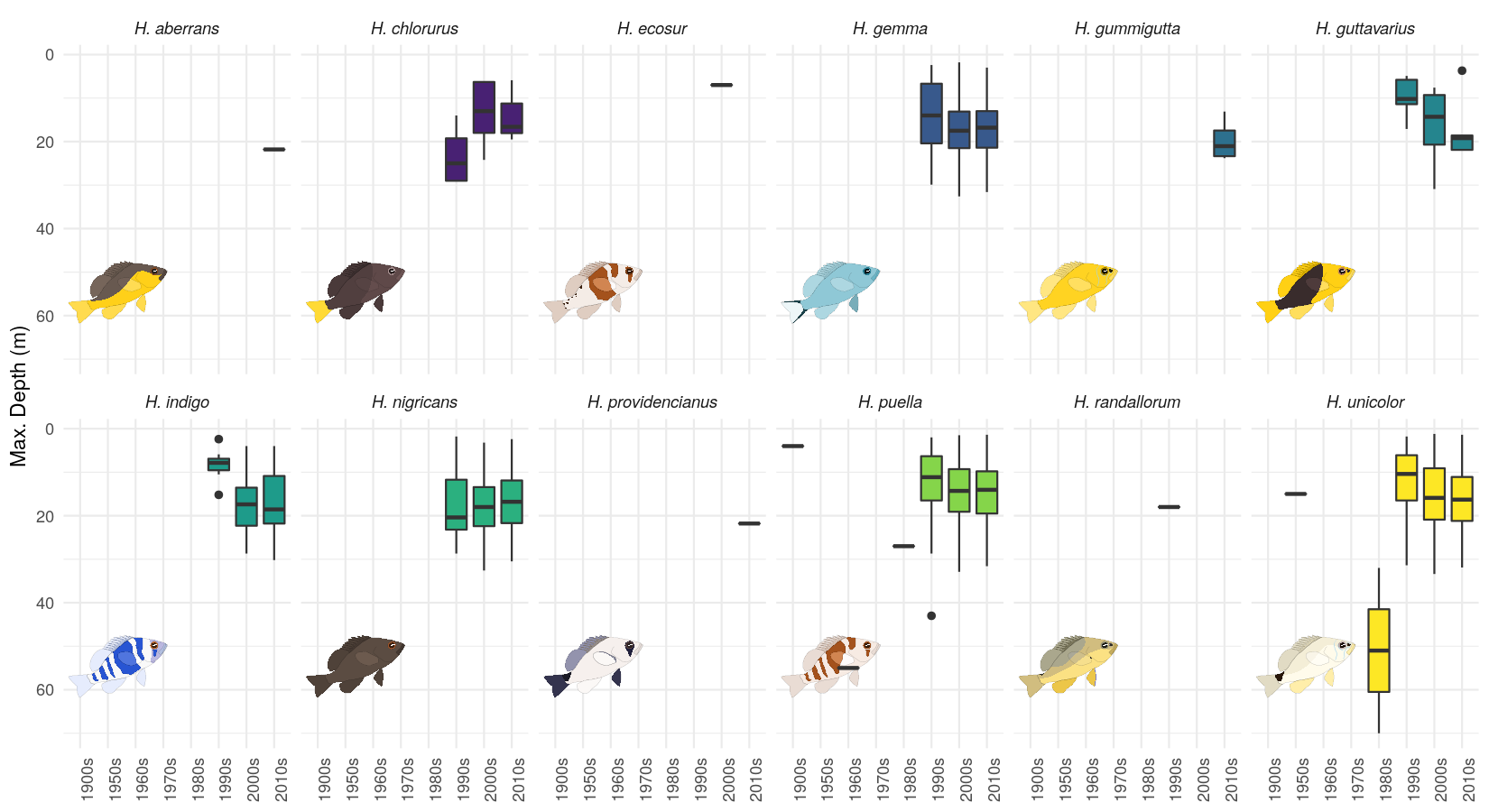
In the following, we will look at how many observations of each hamlet species are documented within the OBIS data base.
To do this we first need to access the database using the robis package. We also are going to group the observations by decade and clean the data a little.
library(robis)
hypo_data <- occurrence(taxonid = 269456) %>%
  select(date_year, scientificName, decimalLatitude,
         decimalLongitude, maximumDepthInMeters) %>%
  mutate(decade = ((as.numeric(date_year) %/% 10) * 10),
         mid_time = str_c(decade,'-06-30') %>% lubridate::as_date(),
         decade = decade %>% str_c(.,'s'))  %>%
  filter(!is.na(decade),
          scientificName != 'Hypoplectrus') %>%
  mutate(scientificName =  str_replace(scientificName ,'Hypoplectrus ', 'H. '))
Then, we write a little function to prepare a tibble containing all the hamlet illustrations needed.
get_image <- function(scientificName, species){
  tibble(scientificName = scientificName,
         grob = list((ggplot()+hypo_anno_r(species)+theme_void()) %>% ggplotGrob()))
  }
We compile the annotation tibble using the new function and all hamlet species contained within the OBIS data set.
grb_tab <- tibble(scientificName = hypo_data$scientificName %>% factor() %>% levels(),
       species = scientificName%>% str_remove('H. ')) %>%
  purrr::pmap(get_image) %>%
  bind_rows()
Now, we can plot the data for the different hamlet species individually using
facet_wrap().
When using geom_hypo_grob() to add the annotations, these will be distributed
correctly over the different subplots.
hypo_data %>%
  ggplot()+
  geom_hypo_grob(data = grb_tab, aes(grob=grob),
                 x = .25, y = .25 ,width = .5, height = .5, angle = 25)+
  geom_boxplot(aes(x = decade, y = maximumDepthInMeters, fill = scientificName)) +
  facet_wrap(scientificName~.,nrow = 2)+
  scale_fill_viridis_d(guide = FALSE)+
  theme_minimal()+
  scale_y_reverse('Max. Depth (m)')+
  theme(strip.text = element_text(face='italic'),
        axis.text.x = element_text(angle=90),
        axis.title.x = element_blank())
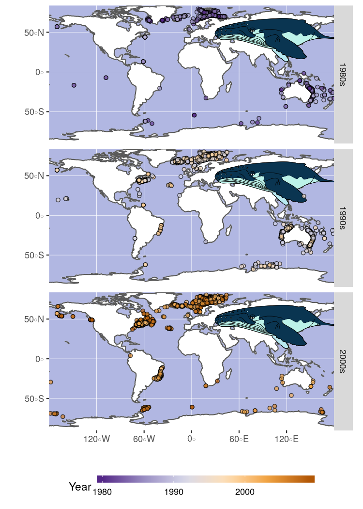
Load your own images
I’m aware that not everyone is working on hamlets.
For everyone else who wants to add different images to their plots, hypoimg
provides the function hypo_read_svg() to import any custom (cairo) svg file.
In this example, we will be looking at the spatial distribution of observations of humpback whales for which we have created this nice illustration using Inkscape.

We can import the image which is saved under humpback.c.svg.
img_tab <- tibble(species = c("Megaptera novaeangliae"),
                  grob = list(hypoimg::hypo_read_svg('humpback.c.svg')))
Then we import the observation data from OBIS:
m_nov <- occurrence("Megaptera novaeangliae") %>%
  select(decimalLongitude, decimalLatitude, year, month, day) %>%
  mutate(species = "Megaptera novaeangliae")
We will restrict the data to the period from 1980 to 2009 and again group the data by decade.
plot_data <- m_nov %>%
  filter(!is.na(year)) %>%
  filter(year >= 1980,
         year <= 2009) %>%
  mutate(decade = ((as.numeric(year) %/% 10) * 10) %>% str_c(.,'s'),
         year = as.numeric(year))
Since these observations are global, we are going to overwrite the coast & landmass data with a low-resolution version.
world <- ne_countries(scale = "small", returnclass = "sf")
coast <- ne_coastline(scale = "small", returnclass = "sf")
Finally, we plot the observations separated by decade and use our custom svg file to annotate the plot.
ggplot()+
  geom_sf(data = world, fill = 'white', color = 'white')+
  geom_sf(data = coast) +
  geom_hypo_grob(data = img_tab, aes(grob = grob),
                 inherit.aes = FALSE, x = .8, y = 0.75, height = .35)+
  geom_point(data = plot_data,
                  aes( x = decimalLongitude,
                       y =  decimalLatitude,
                       fill = year),
               shape = 21, alpha = .7) +
  facet_grid(. ~ decade)+
  scale_fill_distiller('Year', palette = 'PuOr',na.value = 'red') +
  scale_x_continuous('', expand = c(0,0)) +
  scale_y_continuous('', expand = c(0,0)) +
  guides(fill = guide_colorbar(barwidth = 15, barheight = 0.5)) +
  theme( panel.background = element_rect(fill = '#B1B7E2'),
         legend.position = 'bottom',
         strip.text.x = element_text(face = 'italic'))
References
Puebla, O., E. Bermingham, and W. O. McMillan. 2012. “On the Spatial Scale of Dispersal in Coral Reef Fishes.” Molecular Ecology 21 (23): 5675–88. https://doi.org/10.1111/j.1365-294X.2012.05734.x.